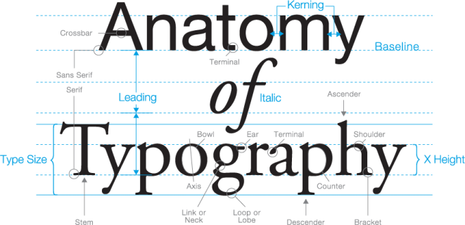
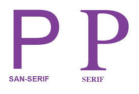
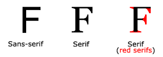
In typography, a sans-serif, sans serif, gothic, san serif or simply sans typeface is one that does not have the small projecting features called “serifs” at the end of strokes.[1] The term comes from the French word sans, meaning “without” and “serif” from the Dutch word schreef meaning “line”. Sans-serif fonts tend to have less line width variation than serif fonts
-
Subscribe
Subscribed
Already have a WordPress.com account? Log in now.


