
I particularly like the style of DIDOT. Its modern, timeless and gives a professional statement.
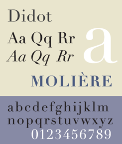
The most famous Didot typefaces were developed in the period 1784–1811. Firmin Didot (1764–1836) cut the letters, and cast them as type in Paris. His brother, Pierre Didot (1760–1853) used the types in printing. The typeface takes inspiration from John Baskerville’s experimentation with increasing stroke contrast and a more condensed armature.

Vogue has been using Didot as the typeface for their cover title since 1955. A survey of 368 people done by writer and typographer Sarah Hyndman suggested that bold typefaces with rounder terminals appear cheaper, whereas lighter weights, serifs, and contrasts were rated as more expensive, with the modern Didot selected as the most expensive looking font.
After researching digital Type logos, i decided to start exploring with different digital typefaces myself and positioning them in different ways to give a variety of ideas.
I particularly like the overlapped look but felt it was too similar to the Calvin Klein logo. I felt it was important in my design to reference the message behind the type logo so it is clear to the audience what business is behind the logo.

https://en.wikipedia.org/wiki/Didot_(typeface)
