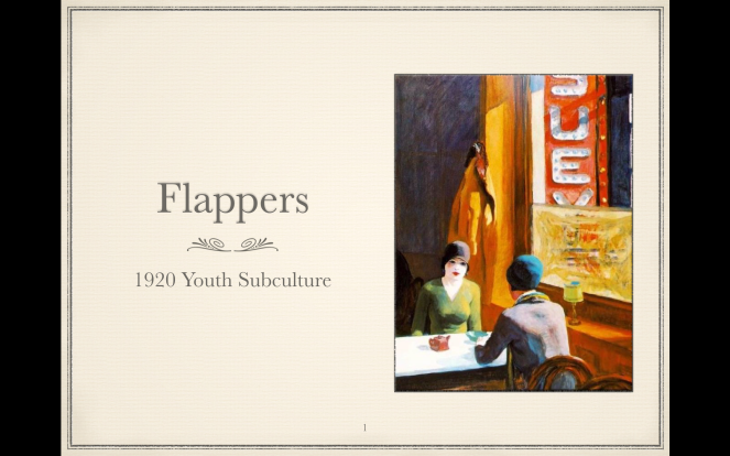
illustration · Illustrator · indesign · play · selecting and rejecting · software · subcultures · visual communication

Development of Vector Portrait

I decided to start my design process with a vector image. I sketched a fine line flapper wearing a Cloche hat and used it as a guide line In Illustrator. I used the pen tool to draw around the curved outline and then started looking at incorporating colour to the design. I thought the brown pattern fits in with the older Flapper 1920’s style

Screen Shot 2015-12-10 at 12.27.19

creativity · ideas · inspiration · subcultures · visual communication

Icon – Symbol – Index

C.S. Pierce was an American who also developed and extended the theory of Semiotics.

Part of his concept for the theory was that Signs can be divided into three differing types.

Icons. These are signifiers that have some sort of physical resemblance to the things that they signify. This category would include photographs, as they have a great deal of resemblance to the things in the photographs. Illustrations would also be counted (mostly) as Iconic Signs. But stick men would also be counted as Iconic as they do resemble the humans they signify. Rivers and roads on a map might also be included as they bear the same shape, simply scaled down. Spoken words that are onomatopoeias, such as “bang” and “whoosh” are iconic because the sound resembles the sound it signifies.

Iconic signs are relative, in that some are more iconic than others. In other words, some signifiers have more resemblance to their signifieds than others do.

Symbols. These are signs where the signifiers are learnt. They are cultural symbols that have no natural resemblance. This is what Saussure meant about signs being arbitrary. Most spoken language falls into the category of symbols because the words are cultural conventions, not instinctive noises.

Written words are always symbolic because letterforms, and indeed numbers and glyphs too are cultural conventions.

Indexes. Indexical signs are ones where the signifier can only exist because of the physical presence of the signified. These might include footprints, smells, animal or musical sounds, fingerprints. Indeed the clues in a detective story would nearly all be indexical signs – the lipstick trace on a wine glass or the blood stain on the weapon. And symptoms of illnesses are indexical signs too, because they only exist (perhaps in combination) with the presence of certain illnesses. Weather is also indexical of certain physical conditions in the atmosphere. Facial expressions and body language are indexes of mood. Smoke is an index of fire, steam of heat and so on.

subcultures

Front cover design process

photo 1I chose to set the scene of a Flapper by using a dressing table and showing the signifying practices of the old and revived Flapper women.

The new signifiers are the IPhone, bottle of beer, candles, photo frame and shoes.

The old signifiers are the Beads, feathers, make-up, wine, perfume, headband and jewels


photo 3


This is one of the images i thought about using, but i felt that you couldn’t really see much of the flapper on a side angle


Below is the image i decided to use as my final cover, as i like the angle on the flapper,and the reflection in the mirror.

You can see the signifiers clearly and making the photo black and white helps create the old flapper look.


photo-10

I decided to develop my idea further in photoshop and add in the items below to the image. I also made the red in her lips a colour to create a different effect

Screen Shot 2015-12-08 at 15.03.48

Here is the background image i chose to use for my background. The feathers work well with the art deco style of the time and bring in some nice gold and green coloursart-nouveau-decor-living-room-design-5

I researched some typefaces on Dafont and chose this retro style called Park Lane, i think works well with the 1920’s design

ArtDeco

subcultures

What makes a good page layout

The primary objective of any page you design, whether it’s for a printed brochure or the latest web app, is to communicate information clearly and effectively to the reader. One of the best ways to ensure that the key messages are delivered to the reader is to create a balanced layout.

Page layout typically involves a lot of placement, rearranging and formatting of elements. Many designers approach this process organically, feeling their way to a pleasing end result. While this can lead to some excellent happy accidents, there is a risk that using a free-form methodology can result in a lack of visual balance on the page.

A good page composition should be both pleasing to the eye, but also communicate those key messages clearly to the intended audience. We’ve collected together some top tips to help you ensure your page layouts have balance. These approaches will work well to provide a structure for balance, regardless of the medium you’re working with.

01. Use a grid

Create balanced layouts 1

One of the easiest ways to ensure your page has a degree of balance is to use a grid system. Grids used to be the sole preserve of the printed page, but much work has been completed online in the past few years to help migrate the concept of the grid across to the digital medium.

By using a grid to inform the position of different elements on a page, you’ll create a connection between the different elements that make up your page. This can help provide a sense of order to your layout, providing the reader with a clear structural reference to fall back on. This is important because when all your page elements have a feeling of connectivity with each other, the overall effect feels more comfortable to the reader, helping to put them at ease, and facilitating their access to the important stuff: the content!

02. Choose a single focal point

Create balanced layouts 2

One of the most effective ways to provide a sense of balance is to choose a single focal point for your layout. A good example of this in practice is the use of a large image as the biggest single element on a page.

A strong visual can provide a powerful way to lead the reader into your page, and also supplies a useful structural element around which to arrange the remaining content in your layout. If you have multiple visual elements, use the proximity principle of Gestalt Theory to group them together, aligning them in the same way.

It’s also worth keeping in mind that you can use a headline or pull quote in the same way; a good display headline can offer as much visual interest as an image, while continuing to provide the structure that will help you ensure a balanced layout.

03. Use the Rule of Thirds

Create balanced layouts 3

One of the best ways to provide a sense of balance is to use the designer’s favourite Rule of Thirds or Golden Ratio. Put simply, the rule of thirds says that if you divide your page into thirds both vertically and horizontally, the points at which the grid lines intersect provide the natural focal points of a composition. By aligning your key elements to these four points, you’ll achieve a more pleasing composition than if you, for example, perfectly centre elements on your page.

In itself the rule of thirds won’t magically provide your layout with balance, but by extending the principle it’s easy to use this tendency towards a natural focal point to help inform the balance of your layout. A common approach is to place the most important elements of your page in the upper (or lower) third of the page, with the primary focal point aligned to match one of the intersections.

04. Use white space

Create balanced layouts 4

It’s common for novice designers to make use of every single bit of space on a page, stuffing in content until every gap has been filled. The more experienced know that sometimes the best bit of design involves leaving elements out, rather than shoehorning them in.

In the printed medium, the most common way to make use of white space is by enlarging the page margins and gutters. On the web, simply providing plenty of breathing room around elements can help make the layout feel composed and balanced. Using negative space works best when you have a clear structure that anchors content together (such as that provided by a grid), as the risk of white space can be a sense of disconnection between page elements if introduced haphazardly.

05. Repeat design elements

Create balanced layouts 5

Another Gestalt principle, repetition can provide a strong sense of connected design and balance to a composition. The idea is that by identifying and re-using a motif or design treatment throughout your layout, you can provide a reference for the reader so that disparate areas feel connected and part of the same overall composition.

You can also use this technique to provide a focal point in your design, while retaining an overall balance, by intentionally breaking the pattern of similarity introduced through repetition.

06. Use hierarchy

Create balanced layouts 6

One of the key approaches to achieving layout nirvana is a clear sense of structure and hierarchy. We’ve already touched on structure, but it’s important to also convey the relative importance of different pieces of content on your page. A headline, for example, should almost always be more visually important than paragraph content.

Look at the different elements that make up your page and decide which is the most important. Use this element to provide a structural hook for the remaining elements on the page,

07. Use scale, contrast, and harmony

Create balanced layouts 7

Finally, the use of scale can be a very effective method for achieving a good visual balance in your layout. By making some elements larger than others, a sense of order and hierarchy will emerge. This helps create a comfortable layout because the viewer will automatically look at the larger elements within the layout first, progressing through to the smaller elements as they read.

This principle also works with increased contrast, so that by isolating an element on the page through contrast will make the eye focus on that point first. This provides a way in to the page, and again gives a useful structural point to develop your layout from.

Both scale and contrast work best when they apply to one element, making it stand out from the other parts of your layout. Use the principles of harmony to make the others feel connected and accentuate the focal point.

http://www.creativebloq.com/netmag/create-balanced-page-layouts-7-pro-tips-121310009

subcultures

Pecha Cusha 20 slide Presentation

Pecha kusha

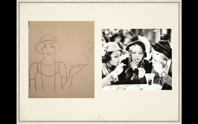
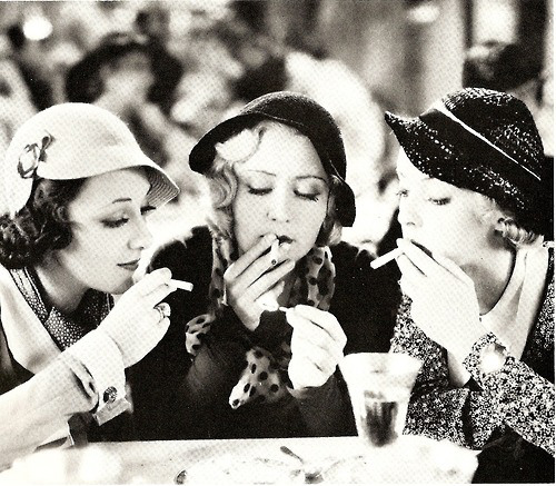
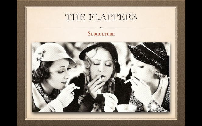
Slide 1: The Flappers are the younger generation from the 1920s. They were very stylish, usually wealthy and they liked to smoke. This is partially due to the fact that in advertisements the cigarette was used to complete the look of sophistication.The speed of life and sexual behaviour usually characterised the Flappers persona. They were daredevils that loved to take risks and be reckless

Screen Shot 2015-12-10 at 12.27.07

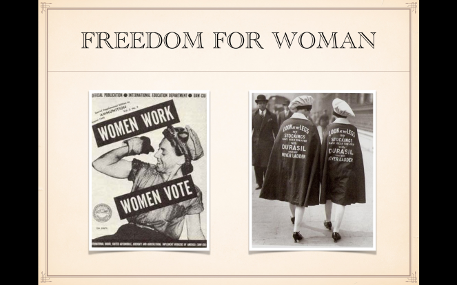
Slide 2: Women generally gained more rights in the 1920’s, and the largest advancement in the movement was giving women the right to vote.Women’s Rights made many changes in women’s lives start to happen, such as taking place in politics, changes at the home, the workplace, and also in education.

Screen Shot 2015-12-10 at 12.27.09

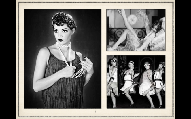
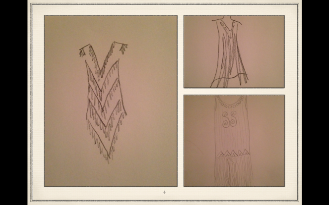
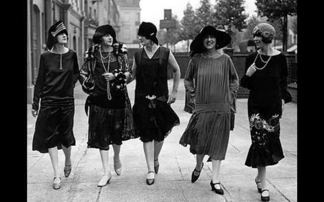
Slide 3: There was a very distinct fashion that went with the flappers. They wore clothing that allowed a lot of movement, straight skirts that went down to their knees, mostly because they wanted to dance a lot to Jazz. The design also allowed them flashes of the leg to be seen which went with their rebellious nature.

Screen Shot 2015-12-10 at 12.27.11

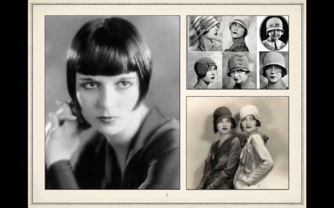
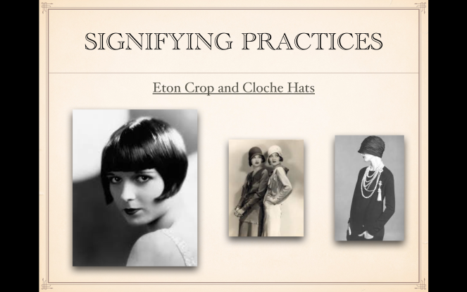
Slide 4: Many hairdressers refused to perform the shocking and highly controversial request of the short bob so they headed to the barbershop and the barbers complied.The bob and the Cloche hats they wore, are both simplifying practices. Researching these helped me think about what to include in my design to help others identify the subculture of the Flappers

Screen Shot 2015-12-10 at 13.47.24.png

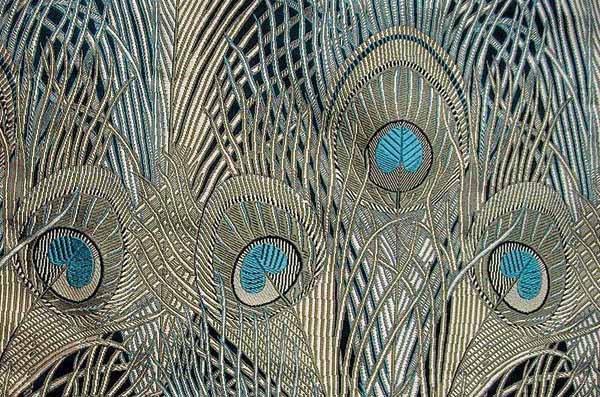
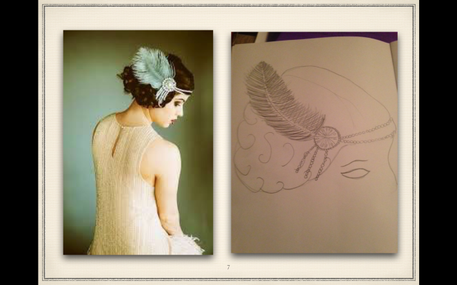
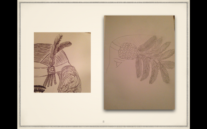
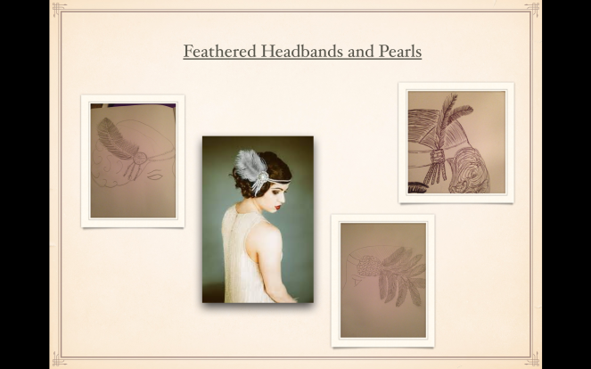
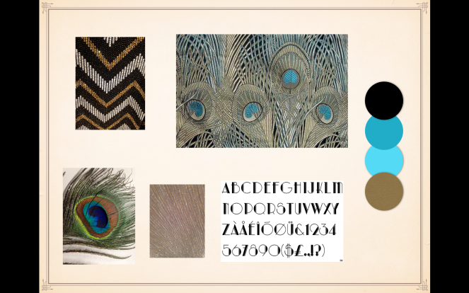
Slide 5: My first sketches for my design were the headbands they wore. They included Feathers, Pearls and a lot of precious stones. Peacock feathers were quite popular in the 1920’s. The green, blue and gold tones were common art deco colours of this time. Feathers were clipped onto the hair on one side of the head to bling-up their hair-dos

Screen Shot 2015-12-10 at 12.27.14

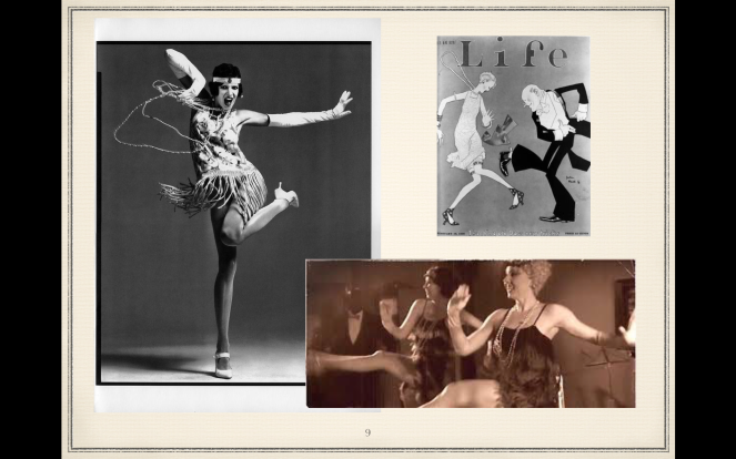
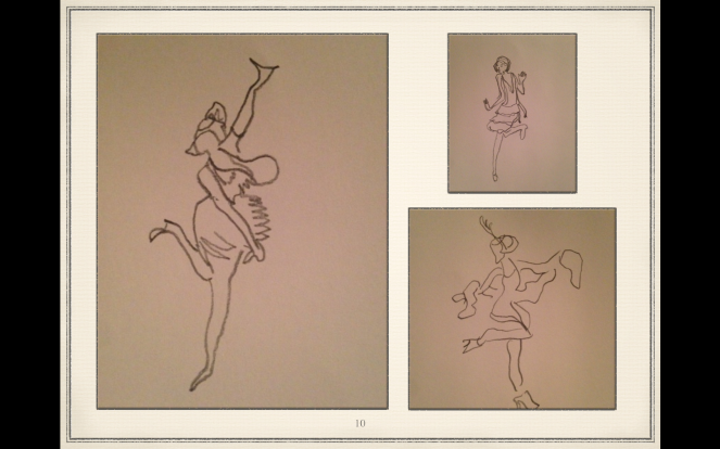
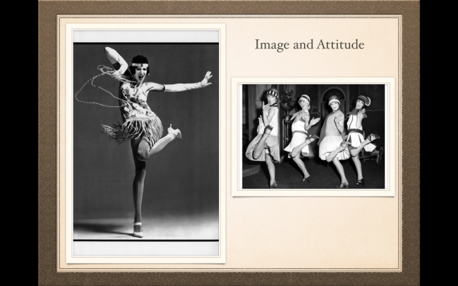
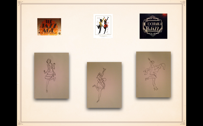
Slide 6: For my next lot of ideas i sketched Flappers dancing. The dances were getting wilder with the new Jazz age and these sketches reflect this and their attitude of wanting to have fun, their rebellious nature and being carefree.The promiscuity of young women caused alarm to the older generation which lead to the Moral Panic.

Screen Shot 2015-12-10 at 12.27.16

Slide 7:By the end of the decade, the incorporation happened and most young women could easily be classed as a semi-flapper, since flapper styles and behaviours were gradually being adopted into mainstream life. Bobbed hair, lipstick, and short skirts were no longer the sign of a flapper, just that of a modern fashionable woman.

Screen Shot 2015-12-10 at 12.27.17

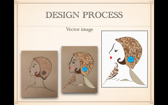
Slide 8: I decided to start my design process with a vector image. I sketched a fine line flapper wearing a Cloche hat and used it as a guide line In Illustrator. I used the pen tool to draw around the curved outline and then started looking at incorporating colour to the design. I thought the brown pattern fits in with the older Flapper 1920’s style

Screen Shot 2015-12-10 at 12.27.19

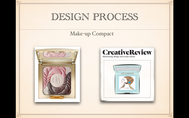
Slide 9: I then went on to develop my design further by seeing this make-up compact as inspiration. I again used Illustrator to create my design on the right, and brought in the vector image of the Flapper. Although i liked the design, i felt it didn’t fit the brief with showing a revival, so i began to look into collages and ways to combine the two

Screen Shot 2015-12-10 at 12.27.20

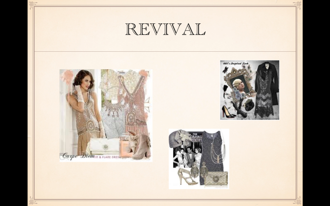
Slide 10: I looked in magazines and online to see that a lot of the Flapper style was currently in fashion now, with the feathers , beads and fringes on clothing. I took some photographs of these when i was out shopping to use as inspiration when thinking of a revival in my design. I liked the idea of creating a real life modern Flapper

Screen Shot 2015-12-10 at 12.27.22.png

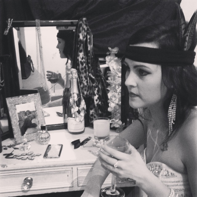
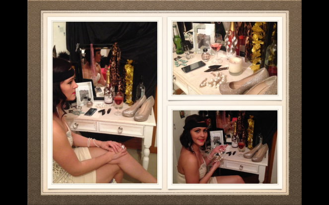
Slide 11: With this idea, i used my sister as a model and set the scene of a revival. I placed modern items into the scene, like her iPhone and bottles of beer and improvised with tights to make a headband. I used the dressing table as a canvas to combine the old and the new items that signify a modern Flapper. I then took photos at different angles to see what would work best

Screen Shot 2015-12-10 at 12.27.23.png

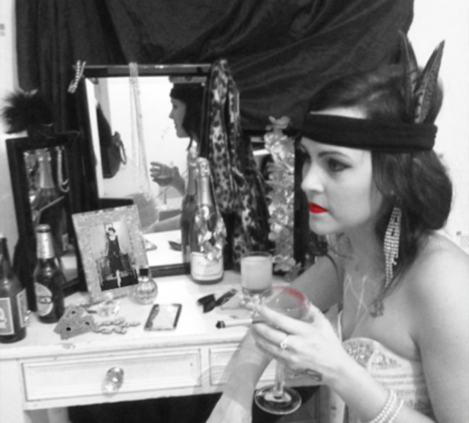
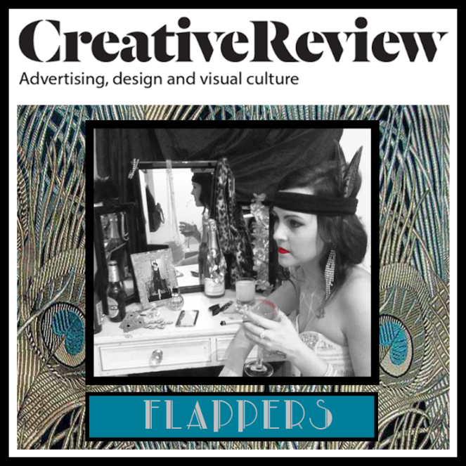
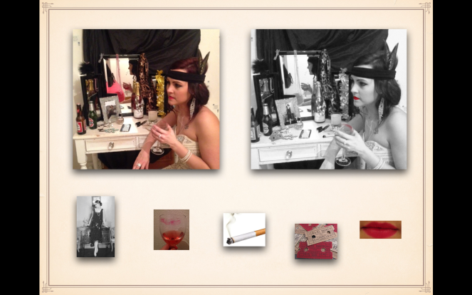
Slide 12: This is the image i chose and developed to black and white to fit in with the older style. I then photoshopped different items into the image to finish off the design i was wanting to gain, adding in a cigarette, theatre tickets, photo of a flapper in the frame and then added colour by bringing out the red lipstick and lip mark on the wine glass

Screen Shot 2015-12-10 at 12.27.25.png

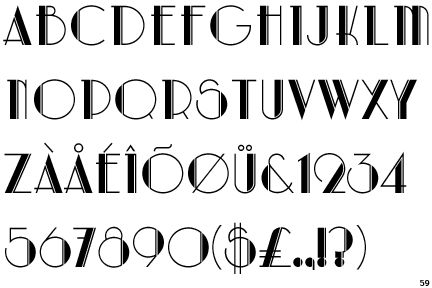
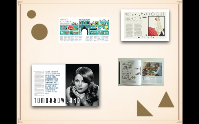
Slide 13: I went on to research different designs and patterns from the Art Deco style for ideas for a background or a border. As mentioned earlier, the peacock feather was a popular fashion item, so i decided to look at these and the popular colours of this time. I also looked into Retro type and liked this one to use on my front cover

Screen Shot 2015-12-10 at 12.27.26.png


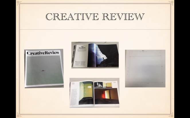
Slide 14: Before piecing my final design together i researched Creative Review magazine, looking at the style, layout, front cover, double page spreads and measuring the dimensions needed. I found it to be quite a formal magazine which i needed to bare in mind with my design in terms of the layout and composition.

Screen Shot 2015-12-10 at 12.27.27.png

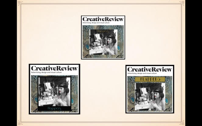
Slide 15: In photoshop, i started to place my chosen background and design onto a template of Creative review, using the measurements i took for sizing. I looked at different typefaces, colours and different borders to see which worked the best. I liked the one on the lower right but felt the photo needed to be framed.

Screen Shot 2015-12-10 at 12.27.29.png

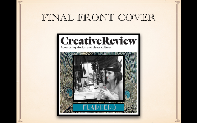
Slide 16: After listening to feedback from others, i chose this as my final front cover. The Frame helps keep the viewer’s focus on the image and the peacock feathers work well with the art deco style of the 1920’s. I used the colours from the feathers for the Type and the heading. By positioning it at the bottom of the page..it doesn’t make the top of the cover too type heavy

Screen Shot 2015-12-10 at 12.27.30.png

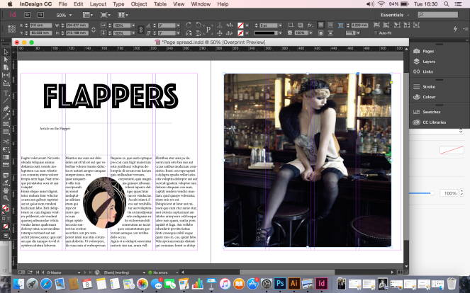
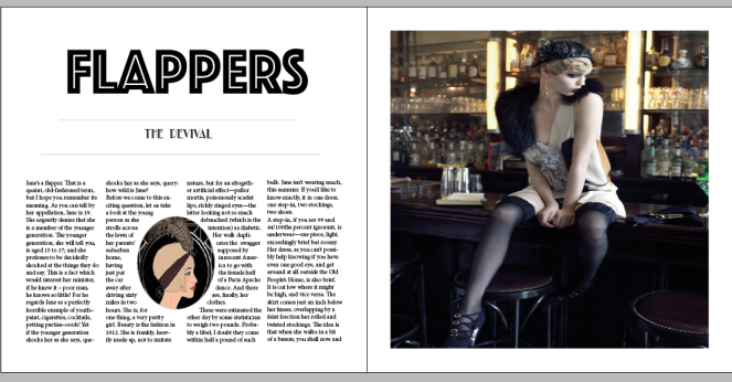
Slide 17: With the double page spread i started my research by looking at Creative Reviews layouts and also layouts from other magazines. I then used the PMI method to identify what points i could reference to when designing my own double page layout. I noted that a visual message accompanying text.. has a greater power to inform, educate, or persuade a person or audience.

Screen Shot 2015-12-10 at 12.27.31.png

Slide 18: Here are some of my thumbnail ideas for my double page spread. I looked at trying to incorporate shapes into the design for the art deco look but felt it made the pages look too busy. I wanted to use one large image to draw the reader in so i looked at different ways i could position this image on the layout and how i could make good use of space on the page.

Screen Shot 2015-12-10 at 12.27.33.png

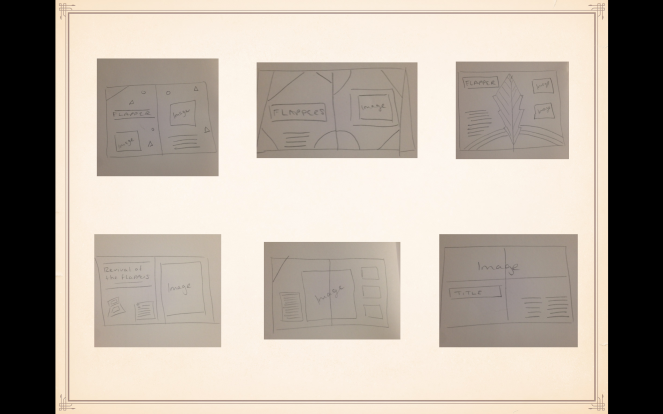
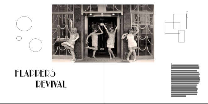
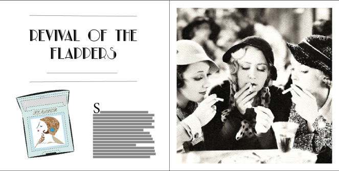
Slide 19: I started to experiment in In-Design with my page layout ideas – here are 2 ideas which i decided not to use in my final design. I tried bringing in my first vector illustration design on the one on the top left, but i felt it didn’t work well with the overall layout. I liked the layout on the second one, but the image wasn’t quite big enough to be able to be positioned fully across the top of the spread.

Screen Shot 2015-12-10 at 12.27.34.png

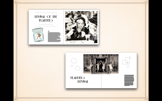
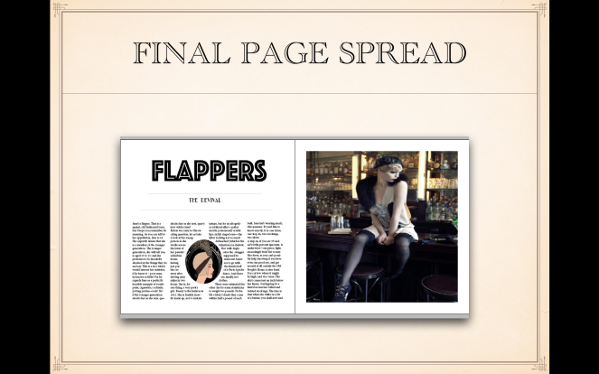
Slide 20: Here is my final double page spread, i chose this image because i feel it represented the Flapper revival well by showing attitude. I used the grid lines and tools in In-Design to create the layout, Margins and columns. For my content, I used an article on a Flapper interview and brought in a small oval illustration between the text to break up the columns, which I think worked well and fits in well with the Creative Review style.

Screen Shot 2015-12-10 at 12.27.36.png

subcultures

Front Cover Final Piece


Here is my final design development for my front cover for Creative Review – The Flapper Revival

The feedback from others helped me finalise my design. The Frame helps keep the viewer’s focus on the image and the peacock feathers work well with the art deco style of the 1920’s.

I used the colours from the feathers for the Typeface and the heading. By positioning it at the bottom of the page..it doesn’t make the top of the cover too type heavy.

Creative Review 1

subcultures

Pecha Cusha -10 slides

We were asked to present a powerpoint presentation with 10 slides of our research and sketches so far of our subculture

Screen Shot 2015-12-10 at 12.00.44

In the 1920’s, a new woman was born. She drank, smoked, partied, cut her hair, wore make-up and voted – she was called the Flapper. The term flapper is supposed to refer to a young bird learning to fly and spreading their wings.

Screen Shot 2015-12-10 at 12.00.49

The Flappers had image and attitude. They made drastic changes to their image by trimming down and lightening their dresses to make movement easier for the new energetic dances of the Jazz age. They also wore long beaded necklaces and heels.

Screen Shot 2015-12-10 at 12.00.51

The dresses are a signifying practice to the Flapper. They were straight and loose, leaving the arms bare and dropping the waistline to the hips. The skirt rose to just below the knee allowing flashes of the leg to be seen when they danced, showing their rebellious nature.

Screen Shot 2015-12-10 at 12.00.53

Another signifying practice is the hats they wore and how they cut their hair. The Eton crop is a very short, slicked down version of the crop. The hats were called Cloche hats and they were fitted in the shape of a bell. Before this, older generations always had longer hair.

Screen Shot 2015-12-10 at 12.00.55

Here is a sketch i drew of a Flapper wearing a cloche hat, make up and the Eton crop. In direct opposition to their mothers, the flappers cut their hair in favour of a more boyish rebellious look, playing with the notions of feminism.

Screen Shot 2015-12-10 at 12.00.59

While cloche hats were worn in the day, headbands called Banbeaus were seen in the evening with their formal dresses. The trend started when King  tomb was discovered in 1924. Soon after, every woman wanted to look like an Egyptian queen.

Screen Shot 2015-12-10 at 12.01.10

The were made from precious stones and pears. Green, Blue and gold tones were common art deco colours of this time.

Screen Shot 2015-12-10 at 12.50.58

The Flappers drank alcohol and danced dances such as the Charleston, black bottom and the shimmy. Flappers symbolised the new freedom by challenging traditional attitudes about women.

Screen Shot 2015-12-10 at 12.51.01

They were considered wild by the older generation. They also drove cars and flaunted their sexuality. Though many were shocked by the flappers skimpy attire and eccentric behaviour, a less extreme version of the flapper became respectable among the young and old and thats when the incorporation came in and the main stream merged with the youth subculture – The Flappers

Screen Shot 2015-12-10 at 12.51.04


subcultures

Flappers – Moral Panic

miss-flapper-tumblr-ann-dvorak-joan-blondell-and-bette-davis-three-on-a-match-1932

The youth of that day hung out in back-street jazz clubs drinking moonshine and playing cards.

An unmistakable symbol of the Roaring Twenties is the rebellious flapper – her dress flowing wildly, her hair chopped and bobbed, her knees exposed (gasp!). Widening eyes and ruffling feathers, her dance moves challenged the conventions of an age and upset the elder generation most profoundly.
In essence, the flapper of the Roaring Twenties became the picture of breaking the status quo, shattering glass ceilings and expressing one’s inner most desires for freedom, self-expression and equality.

Small Changes, Big Effects

Of course, the picture of a rebellious teen or young person challenging the status quo isn’t exactly mind-blowing (each of the aforementioned generations had their own moments of rebellion, after all). But summarising the environment of the flapper as a simple act of rebellion would be a vast truncation and oversimplification of the true cultural phenomenon at hand.

Indeed, seemingly simple decisions that today would be perceived as easy choices of fashion were in fact far more involved, paradigm-bending acts of unmistakable change. Simple decisions, including donning the hairdo that personified the time, might have far reaching consequences.

Emboldened by the Bob -the decision to chop ones locks certainly wasn’t made lightly. After summarizing the short story, “Bernice Bobs Her Hair,” in which a young woman of the era embraces the short do, the post continues:

“With her new do, she is castigated by everyone: Boys no longer like her, she’s uninvited to a social gathering in her honor, and it’s feared that her haircut will cause a scandal for her family.

“In the beginning of the 20th century, that’s how serious it was to cut off your locks. At that time, long tresses epitomized a pristine kind of femininity exemplified by the Gibson girl. Hair may have been worn up, but it was always, always long.
“Part and parcel with the rebellious flapper mentality, the decision to cut it all off was a liberating reaction to that stodgier time, a cosmetic shift toward androgyny that helped define an era.”
In a time when androgyny was a four letter word and society was overwhelmingly patriarchal, it becomes clear how the flapper created big waves.
Like any trail blazer, the actions of flappers transcended mere fashion or turns of creative expression – they challenged a paradigm to rewrite the future in a way they saw fit.

http://www.thedandy.org/home/flappers-then-and-o