Bomb project · Experience Design · FMP · ideas · Journey Map · Lightmaker brief · Website design · World of Tanks - WOTX

Sketches of story idea

I sketched out ideas taken from inspiration from the world of tank website, showing a story board for the website homepage. My concept is to engage the user at first instance, using Experience DesignCognition, Sensory perception and Emotion.  I was trying to get into a mans head and how they feel about machinery. Having the power to control a machine excites them, brings an adrenalin rush. I thought combining real images from the war and placing them in the game would incorporate more meaning to people.


20170228_17522120170228_17530920170228_17550320170228_17554020170228_175638

web accessibility · Website analysis · Website design

Web Accessibility

What is Web Accessibility
Web accessibility means that people with disabilities can use the Web. More specifically, Web accessibility means that people with disabilities can perceive, understand, navigate, and interact with the Web, and that they can contribute to the Web. Web accessibility also benefits others, including older people with changing abilities due to aging.

Web accessibility encompasses all disabilities that affect access to the Web, including visual, auditory, physical, speech, cognitive, and neurological disabilities. The document “How People with Disabilities Use the Web” describes how different disabilities affect Web use and includes scenarios of people with disabilities using the Web.

Millions of people have disabilities that affect their use of the Web. Currently most Web sites and Web software have accessibility barriers that make it difficult or impossible for many people with disabilities to use the Web. As more accessible Web sites and software become available, people with disabilities are able to use and contribute to the Web more effectively.

Web accessibility also benefits people without disabilities. For example, a key principle of Web accessibility is designing Web sites and software that are flexible to meet different user needs, preferences, and situations. This flexibility also benefits people without disabilities in certain situations, such as people using a slow Internet connection, people with “temporary disabilities” such as a broken arm, and people with changing abilities due to aging. The document “Developing a Web Accessibility Business Case for Your Organization” describes many different benefits of Web accessibility, including benefits for organizations.

Why Web Accessibility is Important
The Web is an increasingly important resource in many aspects of life: education, employment, government, commerce, health care, recreation, and more. It is essential that the Web be accessible in order to provide equal access and equal opportunity to people with disabilities. An accessible Web can also help people with disabilities more actively participate in society.

The Web offers the possibility of unprecedented access to information and interaction for many people with disabilities. That is, the accessibility barriers to print, audio, and visual media can be much more easily overcome through Web technologies.

The document “Social Factors in Developing a Web Accessibility Business Case for Your Organization” discusses how the Web impacts the lives of people with disabilities, the overlap with digital divide issues, and Web accessibility as an aspect of corporate social responsibility.

Another important consideration for organizations is that Web accessibility is required by laws and policies in some cases. WAI Web Accessibility Policy Resources links to resources for addressing legal and policy factors within organizations, including a list of relevant laws and policies around the world.

Making the Web Accessible
Much of the focus on Web accessibility has been on the responsibilities of Web developers. However, Web software also has a vital role in Web accessibility. Software needs to help developers produce and evaluate accessible Web sites, and be usable by people with disabilities.

One of the roles of the Web Accessibility Initiative (WAI) is to develop guidelines and techniques that describe accessibility solutions for Web software and Web developers. These WAI guidelines are considered the international standard for Web accessibility.

The document “Essential Components of Web Accessibility” describes the different Web accessibility roles, and how specific improvements could substantially advance Web accessibility.

Making Your Web Site Accessible

Making a Web site accessible can be simple or complex, depending on many factors such as the type of content, the size and complexity of the site, and the development tools and environment.

Many accessibility features are easily implemented if they are planned from the beginning of Web site development or redesign. Fixing inaccessible Web sites can require significant effort, especially sites that were not originally “coded” properly with standard XHTML markup, and sites with certain types of content such as multimedia.

The document “Implementation Plan for Web Accessibility” lists basic steps for addressing accessibility in Web projects. The Web Content Accessibility Guidelines and techniques documents provide detailed information for developers.

Evaluating the Accessibility of a Web Site

When developing or redesigning a site, evaluating accessibility early and throughout the development process can identify accessibility problems early when it is easier to address them. Simple techniques such as changing settings in a browser can determine if a Web page meets some accessibility guidelines. A comprehensive evaluation to determine if a site meets all accessibility guidelines is much more complex.

There are evaluation tools that help with evaluation. However, no tool alone can determine if a site meets accessibility guidelines. Knowledgeable human evaluation is required to determine if a site is accessible.

The document “Evaluating Web Sites for Accessibility” provides guidance on preliminary reviews using techniques to quickly assess some of the accessibility problems on a site. It also provides general procedures and tips for evaluating conformance to accessibility guidelines.

https://www.w3.org/WAI/intro/accessibility.php

design · research · signifiers · Typography · Website analysis · Website design

Type on the Web

To be effective on a Web site, typography needs to be: clean, clear, appealing, and readable. Good web typography can attract, engage, and keep your viewer on your site.

Establish – and then follow – good typographic hierarchy. Use titles and subheads to create emphasis and get your point across before a viewer gets bored and clicks out of a page or a site. Also try using bold and italic versions, color, and case (caps, lowercase, or mixed case) to reinforce/emphasize content priority and maintain good flow.
Beware of small type. Type size is one of the most important factors when designing with type on the Web. Small type is hard to read at the lower resolution of most screens and monitors. Go larger rather than smaller to ensure optimal reading on all monitors, as well as on smaller screens: laptops, iPads, and hand-held devices.
Avoid justified text, as it frequently leads to bad spacing, including the dreaded rivers of white space. What the viewer sees on the Web, typographically speaking, is dependent on several variables, including: browser, monitor settings, font style and size preferences, as well as platform (Mac or PC). This means that line breaks vary from computer to computer, which can lead to some truly awful spacing if text is justified. Stick with flush left or centered type.
Use smart punctuation, including smart, or typographer’s quotes, as well as en and em dashes, rather than primes, double hyphens and other “dumb” typography. These professional typographic conventions are as appropriate on the Web as they are in print.
Use special effects sparingly. You can create visual confusion by going overboard with gradients, shadows, and other special effects. Using them occasionally and wisely will go a long way toward emphasizing your type and creating pages that are engaging/attractive. Similarly, use a light hand with busy or cutesy icons, buttons, and starbursts.

Create high contrast between the color of the type and the background. Achieve this by selecting light, neutral backgrounds for darker type (and the reverse). Avoid placing type on a busy background, which can make it hard to read.
Properly size typographic images to the required pixel dimensions. This is worthwhile for banners, logos, and teasers. Simply scaling up reduces sharpness, readability, and effectiveness. Simply reducing a web image makes for a larger file and a longer loading time.Screen Shot 2016-02-29 at 11.47.00

Build in plenty of “white” space (even when it is not white) around your type as well as in the overall design. Crowding type (as well as other elements) can make a Web page less inviting, more difficult to read, and just plain confusing.


http://www.fonts.com/content/learning/fyti/typographic-tips/8-tips-for-type-on-the-web

CSS · Digital Media · research · Website analysis · Website design

CSS

What is CSS?
CSS is a Style Sheet Language.

Description
CSS stands for Cascading Style Sheet. CSS can format the document content(written in HTML or other markup language):

layout
colors
fonts
… etc.

CSS is designed primarily to enable the separation of the document content and document format. As a result, we can improve content accessibility, can similarly format two or more documents.

p{
color: red;
font-size: 12px;
background-color: green;
}

Adding style to HTML
There are three ways of providing styling information for the Web browsers.

Linking style sheet
You can separate style sheets from HTML documents. Style sheet files are imported to HTML documents by <link>.

This offers several benefits:

Authors and Web site managers may share style sheets across a number of documents (and sites).
Authors may change the style sheet without requiring modifications to the document.
User agents may load style sheets selectively (based on media descriptions).

[example.html]

<head>
<link rel=”stylesheet” type=”text/css” href=”example.css”>
</head>
[example.css]

p{
color: red;
foto-size: 120%;
}

See also The link element.
You can put style sheet rules in the head of the document by <style>.
[example.html]

<head>
<style>
p { color: red; font-size:120%; }
</style>
</head>
<body>
<p>This is a paragraph</p>
</body>

See also The style element.
The start tags can contain style sheet rules directly in HTML documents by the style attribute.
[example.html]

<p style=”color: red; font-size:120%; “>This is a paragraph</p>

https://www.w3.org/wiki/CSS/Training/What_is_CSS

Screen Shot 2016-02-29 at 11.21.10Screen Shot 2016-02-29 at 11.21.34

http://www.w3schools.com/css/tryit.asp?filename=trycss_default

Digital Media · HTML · research · Website analysis · Website design

HTML

The HyperText Markup Language (HTML) is the publishing language of the World Wide Web. It is one of the main components of the Open Web Platform. The first version of HTML was described by Tim Berners-Lee in late 1991. The current W3C Recommendation for HTML is HTML 4.01, published in December 1999. There is however intensive work to define its next version, HTML5.

HTML has been traditionally served with text/html mime type. When developing XHTML 1.0, XHTML 1.1, a transition to application/xhtml+xml. A minority of documents (less than 0.003%) are being served with this latter mime type.

https://www.w3.org/wiki/HTML

Screen Shot 2016-02-29 at 11.15.21Screen Shot 2016-02-29 at 11.15.38Screen Shot 2016-02-29 at 11.15.58Screen Shot 2016-02-29 at 11.16.05Screen Shot 2016-02-29 at 11.16.14

http://www.w3schools.com/html/html_basic.asp


Design process · research · signifiers · Website analysis · Website design

Good & Bad Website Design Features

Here is a list of good and bad web design features found from research. I will be referencing to these during my own website design development to ensure i have explored and made good use of all features.

GOOD

Text
Background does not interrupt the text
Text is big enough to read, but not too big
The hierarchy of information is perfectly clear
Columns of text are narrower than in a book to make reading easier on the screen

Navigation
Navigation buttons and bars are easy to understand and use
Navigation is consistent throughout web site
Navigation buttons and bars provide the visitor with a clue as to where they are, what page of the site they are currently on
Frames, if used, are not obtrusive
A large site has an index or site map

Links
Link colors coordinate with page colors
Links are underlined so they are instantly clear to the visitor

Graphics
Buttons are not big and dorky
Every graphic has an alt label
Every graphic link has a matching text link
Graphics and backgrounds use browser-safe colors
Animated graphics turn off by themselves

General Design
Pages download quickly
First page and home page fit into 800 x 600 pixel space
All of the other pages have the immediate visual impact within 800 x 600 pixels
Good use of graphic elements (photos, subheads, pull quotes) to break up large areas of text
Every web page in the site looks like it belongs to the same site; there are repetitive elements that carry throughout the pages

BAD

Backgrounds
Default gray color
Color combinations of text and background that make the text hard to read
Busy, distracting backgrounds that make the text hard to read

Text
Text that is too small to read
Text crowding against the left edge
Text that stretches all the way across the page
Centered type over flush left body copy
Paragraphs of type in all caps
Paragraphs of type in bold
Paragraphs of type in italic
Paragraphs of type in all caps, bold, and italic all at once
Underlined text that is not a link

Links
Default blue links
Blue link borders around graphics
Links that are not clear about where they will take you
Links in body copy that distract readers and lead them off to remote, useless pages
Text links that are not underlined so you don’t know they are links
..(If you’re not going to underline your links, please make darned sure
..that each link is perfectly clearly a link! Don’t make me wander around
..with my mouse checking to see if randomly colored text is a link!)
Dead links (links that don’t work anymore)

Graphics
Large graphic files that take forever to load
Meaningless or useless graphics
Thumbnail images that are nearly as large as the full-sized images they link to
Graphics with no alt labels
Missing graphics, especially missing graphics with no alt labels
Graphics that don’t fit on the screen (assuming a screen of 800 x 600 pixels)

Tables
Borders turned on in tables
Tables used as design elements, especially with extra large (dorky) borders

http://www.ratz.com

Digital Media · research · Website analysis · Website design

Digital Media example

Screen Shot 2016-02-22 at 13.40.38

Facebook is an example of digital media. It can be created, viewed and edited on digital electronic devices such as an App and online Webpage.

Screen Shot 2016-02-22 at 13.40.54

It uses a range of Multimedia throughout the site – Text, Audio, Digital images, Digital videos and interactive content.

This media is available to everybody. A personal page can be created by the user to present and share their interests with their friends and family. The home page has everything they need to navigate their way around by having the menu bar on the left hand side, a news feed as a central page, notifications and advertising on the left hand side, along with a pop up list of friends that are currently online.

At the top of the page they have a search bar which is very useful for a faster navigation. I like the way they use picture images to reference ‘Friends’ tab and ‘messenger’ tab.

Screen Shot 2016-02-22 at 13.42.29

I personally use this media and enjoy the digital aspects which have evolved and expanded since they first launched. Screen Shot 2016-02-22 at 14.02.26

They have recently added another media linked to their page called the Facebook messenger which they have produced a separate App for to make messaging on their site easier for their users.


research · Website analysis · Website design

Spin

Screen Shot 2016-02-20 at 14.26.05

Spin is a commercial website showing a portfolio of their work that they have designed for their clients. They have aimed their website at potential clients, users.

My first impressions of this website were that it is very contemporary and has a professional feel.

Plus – The visual aesthetics overall of this website are very graphical with a lot of imagery.

Minus – There is very little text through the website, leaving most of the communication through the images. I think a little more explanation on the design would be beneficial to the audience and also so they can gauge what their thought process is on their designs.

Interesting – I found the images interesting by putting the designs on a black background. This made the images stand out more.

Screen Shot 2016-02-20 at 14.27.37

The type is clear and readable with good spacing. They have used the same typeface throughout the webpage which runs with the theme.

The dark grey and black background colour is consistent throughout each page. I think this works well in presenting the type of designers they are.

The pages are a good size and length, they have selected a few items on each page and not overcrowded with imagery.

The navigation works well overall, the menu bar in the top right hand corner opens up to select further into other sections of the site. Screen Shot 2016-02-20 at 14.27.06

They have designed a waiting tool of a box with 4 different colour triangles, which go around to show that the page is loading. The helps the user understand thats its working and to wait for the page to load rather then thinking that the page is stuck. Screen Shot 2016-02-20 at 14.28.18 1

http://spin.co.uk/work/identity

research · Website analysis · Website design

Why not Associates

Why not Associates is a commercial site for a graphic design company. If i were a potential client looking at this page, their would be no chance of them receiving my custom.

Screen Shot 2016-02-20 at 14.22.20

This website must be the worst one i have come across on the web. The opening page is terrible, showing an in your face image of a tacky car rental sign. It reflects very poorly on their skills as a graphic design company and doesn’t make me want to look further into their site.

Screen Shot 2016-02-20 at 14.22.23
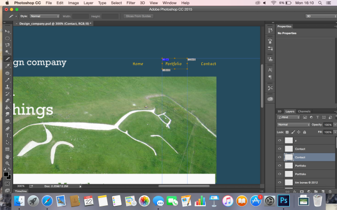
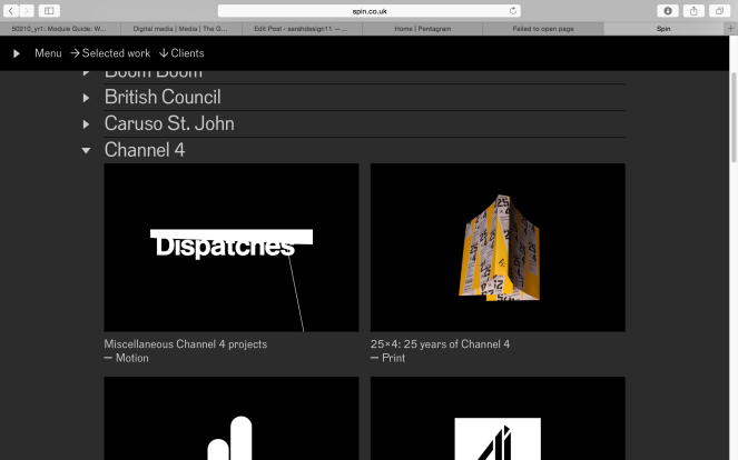
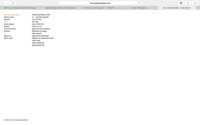
The menu for the contents is displayed in very small type at the top right hand corner of the page. They haven’t used any capital letters and the white text makes it fade into the image in the background.
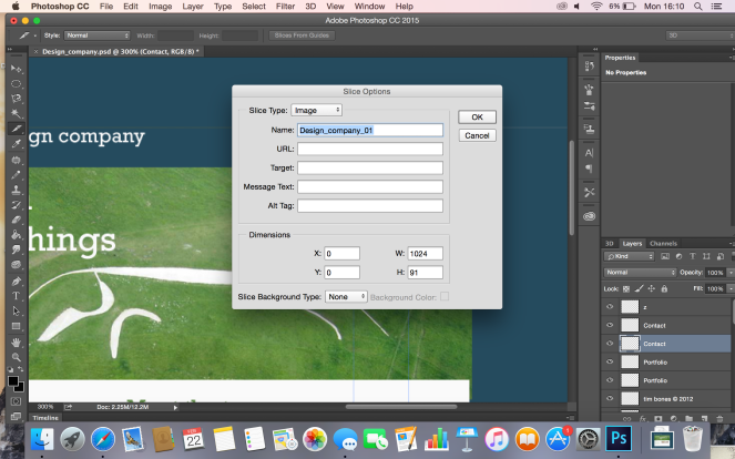
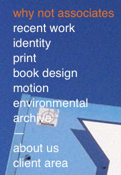
Plus – They have categorised their work into folders so its easier for the user to see what is what.

Minus – Very unprofessional in the whole context of this webpage. Layout is terrible with them leaving a lot of white space on the page and no images. There is no scroll on the page, and it took me a while to realise i had to click and slide sideways on the page to see more images etc. There was no indicator to guide me to do this.

Interesting – Images moving sideways instead of up and down on a scroll i think is interesting and could be a bit different.

They have used no heading for the name the company and no other typeface in the page. It makes the page very boring and unappealing to the eye.

Screen Shot 2016-02-20 at 14.23.39

This image below shows how the images move anywhere on the screen, over the type content making harder to read.

Screen Shot 2016-02-20 at 14.23.03