
The 4 double page spreads finals
Design Portfolio
The 4 double page spreads finals
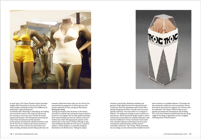
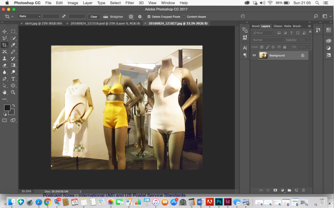
The photograph i took of the vintage swimwear came under their underwear section. I uploaded to photoshop and edited the image to remove the tennis sportwear.
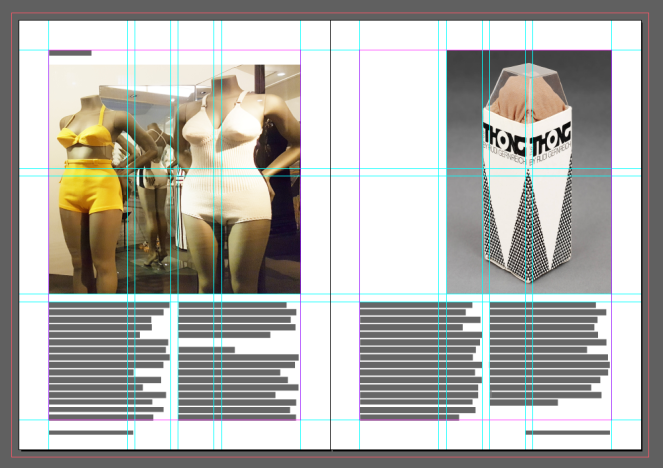
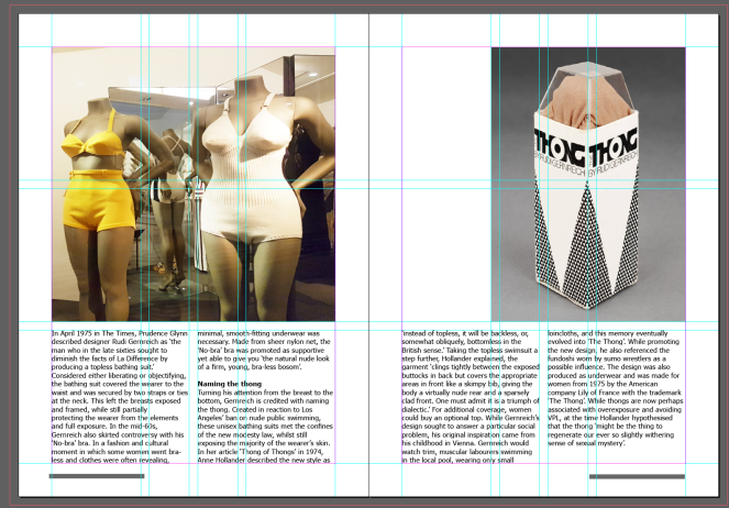
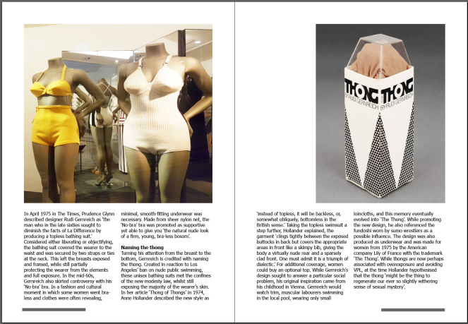
From the V&A article i used the thong box image and copy of text to include in this spread.
https://www.vam.ac.uk/articles/the-thong


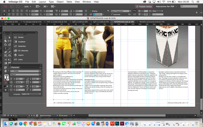
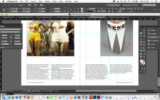
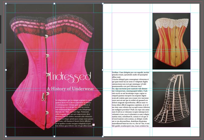
Final design of 3rd spread
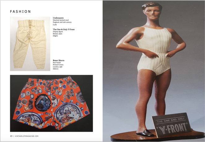
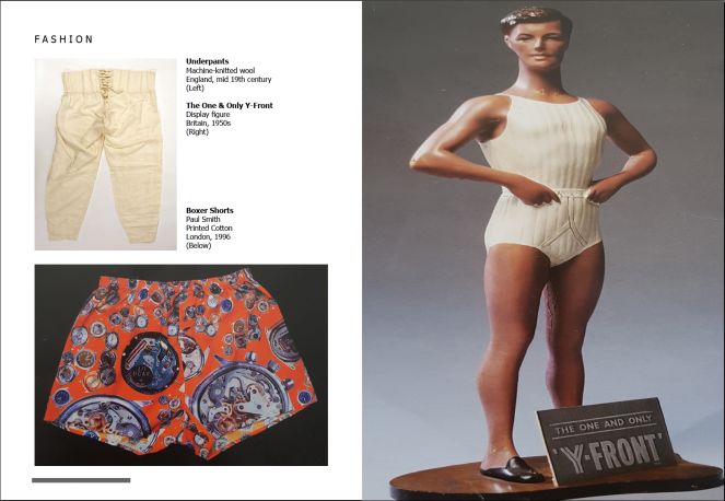
I included a spread on the vintage mens underwear. The images of the male manikin and boxer shorts were photographs from the postcards at the exhibition and the other is a found image from the online article.


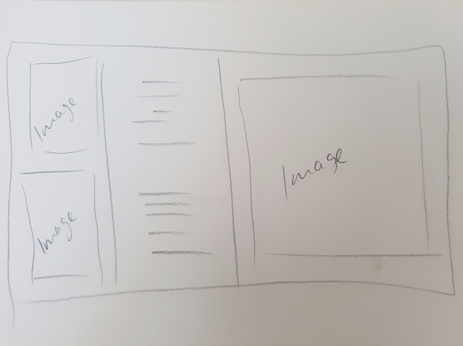
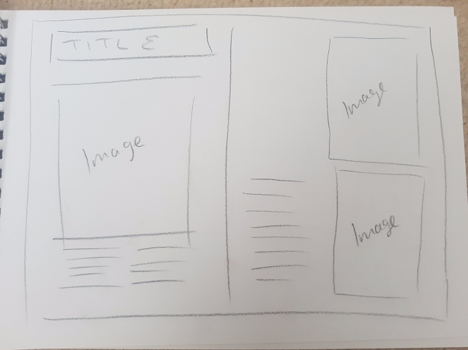
Sketch
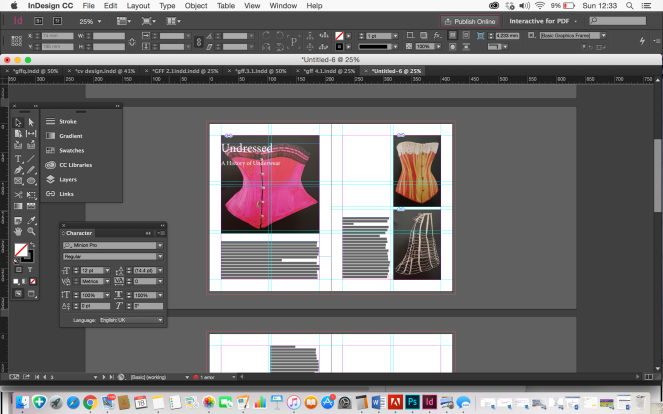
I continued to work to the grid and measurements from the previous pages
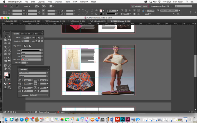
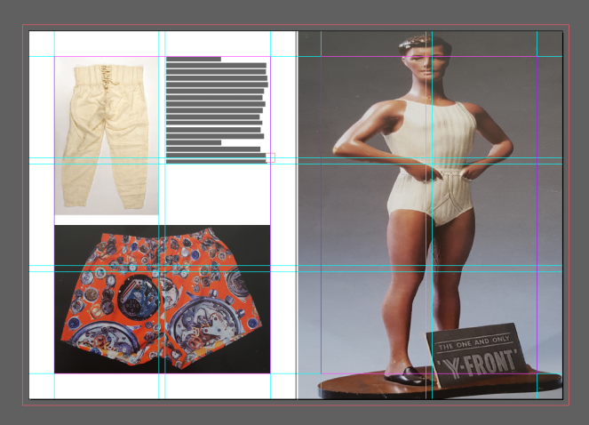
I kept the text small for this spread, just anchoring the images from their descriptions.
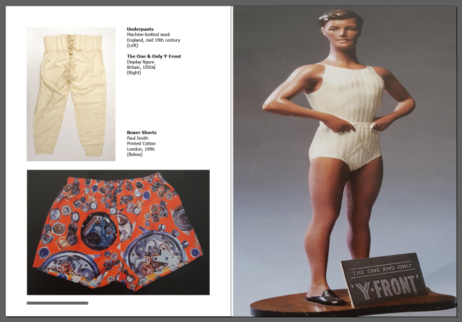
Final design of male underwear spread
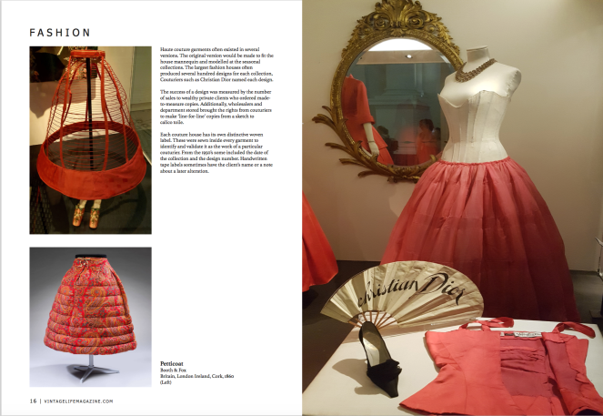
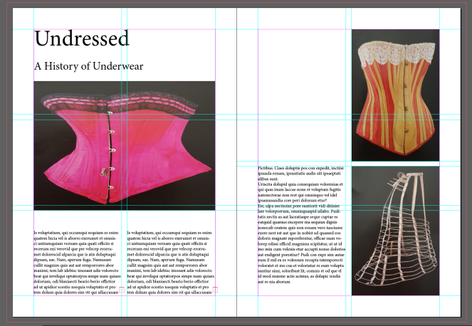
I used the three photographs below for the next spread, carrying on with the same article. The 2 photographs on the left were my own from the exhibition and the one on the right, a found image online from the exhibition website


I used the write up from the exhibition to describe the images
The grid continues from the previous spread. I mirrored the first spread layout by creating the opposite positioning of the images and type.
Final design of second spread
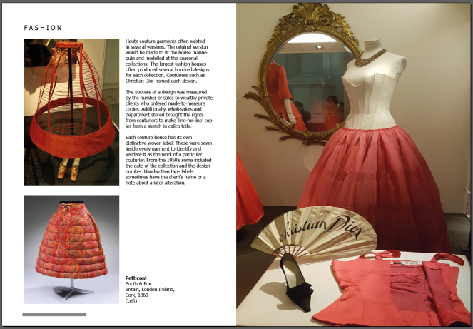
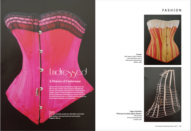
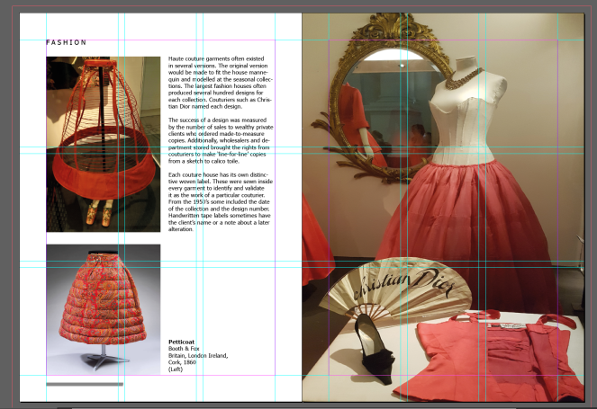
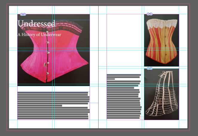
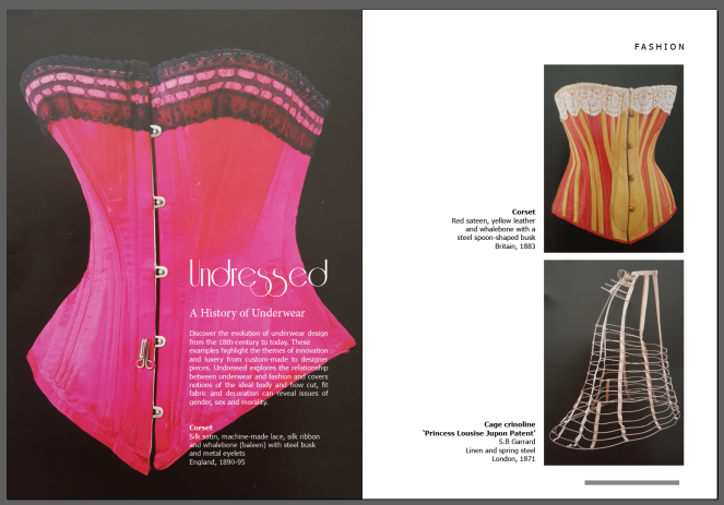
I chose the three images i took of the postcards below for my first spread as a fashion article


I created a grid and insert the correct measurements for the borders and gutter from my magazine
I started out placing the elements of image and placeholder text in the layout of my sketch
I added in the title and straight away i could see i wanted to see if it could work as a better design layout
I changed the image to fit the first page and moved the title and subtitle of the article over the image. I researched for a vintage typeface for the title, choosing a downloaded font called – Riesling.
The subtitle i chose a serif typeface to compliment the title font – Athelas

As i was using the description from the back of the postcards about the products, i decided to separate the text column on the right page to anchor each image
The vintage magazine had the named section of the article in which it fits in on the top corner of the page and the bottom of the pages has the magazines website and page number. I studied the typeface and chose ‘Tahoma’ to be the most similar and amended the spacing and size of the text accordingly.


Final design page spread 1
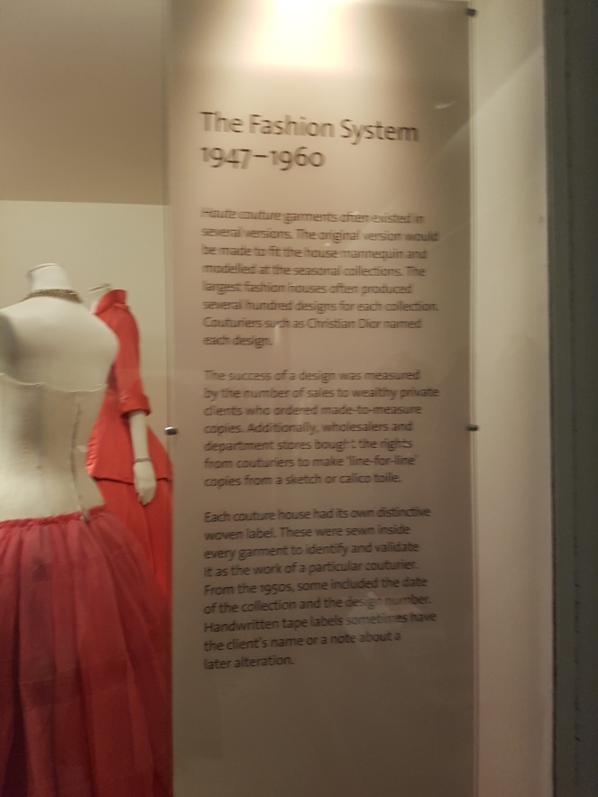
I visited the V&A museum in the summer which had exhibitions on Vintage fashion, including Undressed: A Brief History of Underwear
https://www.vam.ac.uk/articles/the-thong
I took photographs and picked up postcards of vintage fashion designs to include in my spreads.


