In graphic design, a grid is a structure (usually two-dimensional) made up of a series of intersecting straight (vertical, horizontal, and angular) or curved guide lines used to structure content. The grid serves as an armature or framework on which a designer can organize graphic elements (images, glyphs, paragraphs, etc.) in a rational, easy-to-absorb manner. A grid can be used to organize graphic elements in relation to a page, in relation to other graphic elements on the page, or relation to other parts of the same graphic element or shape.
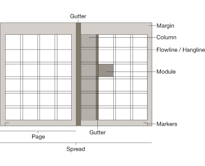
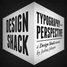
A grid can be used to show dimension in images as shown in the image below –
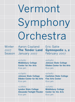
Below you can see an example of how a grid has been used to place the text in an organised layout.
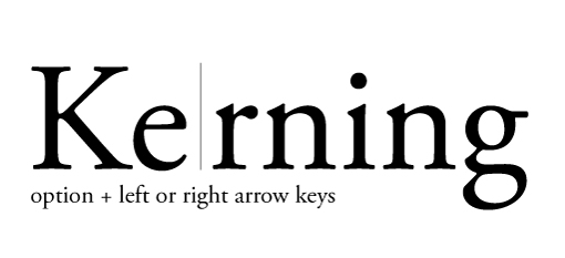
Kerning
In typography, kerning (less commonly mortising) is the process of adjusting the spacing between characters in a proportional font, usually to achieve a visually pleasing result. Kerning adjusts the space between individual letter forms, while tracking (letter-spacing) adjusts spacing uniformly over a range of characters.[1] In a well-kerned font, the two-dimensional blank spaces between each pair of characters all have a visually similar area.
Below are some images of Bad Kerning which results in the communication being read in-correctly