FMP · giving for futures · Options Module part 1

Evaluation & Reflection – FMP

Evaluation and Reflection for FMP – Giving for Futures

1) Visual Communication:

In what ways does the visual communication/message of the piece meet the needs of the brief?

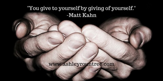
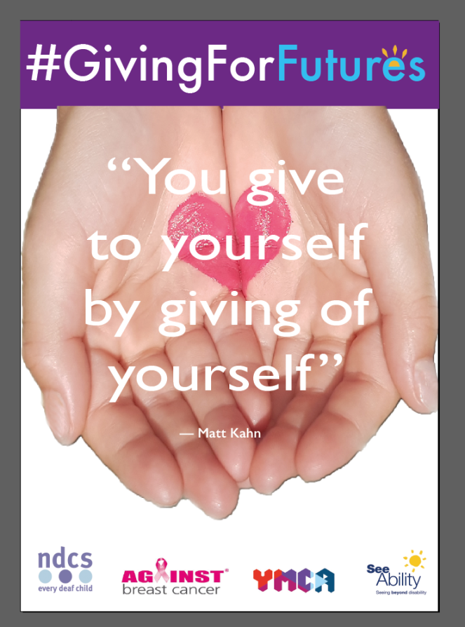
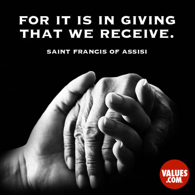
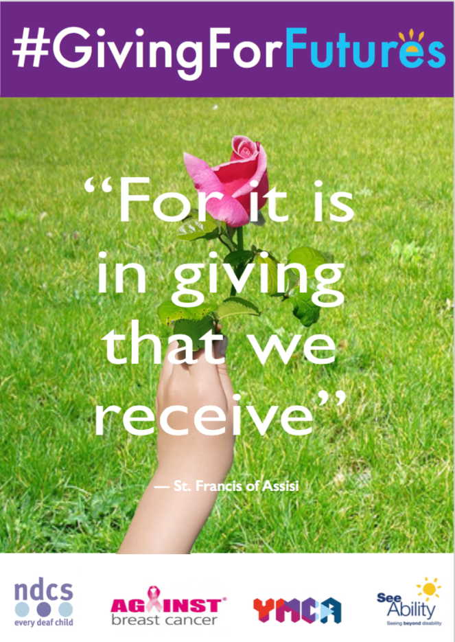
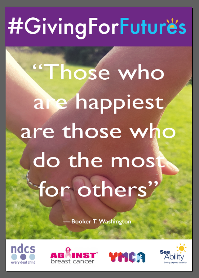
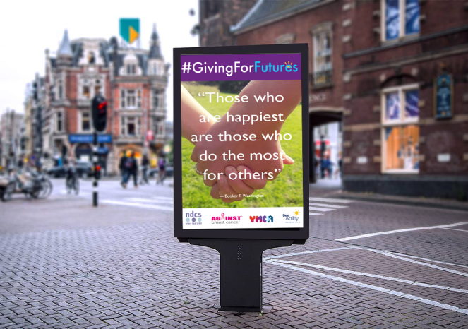
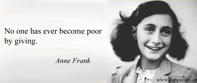
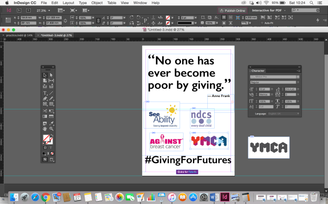
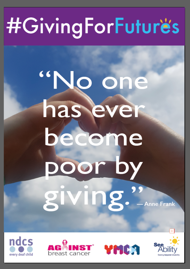
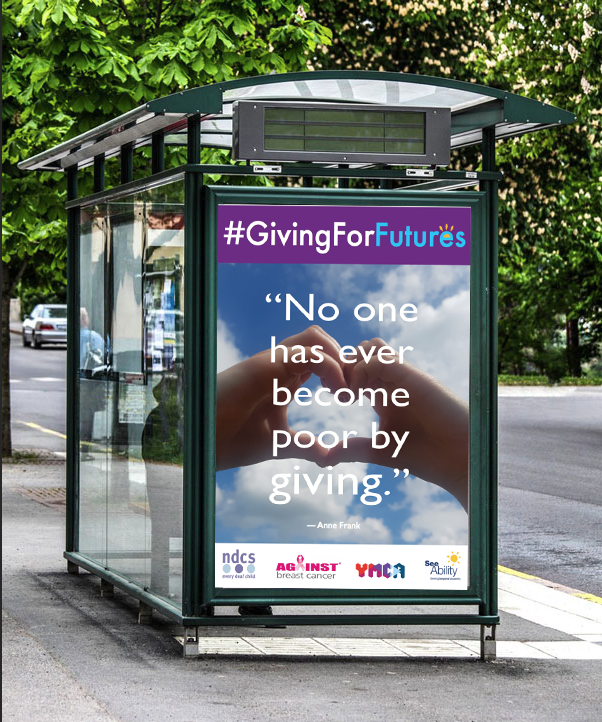
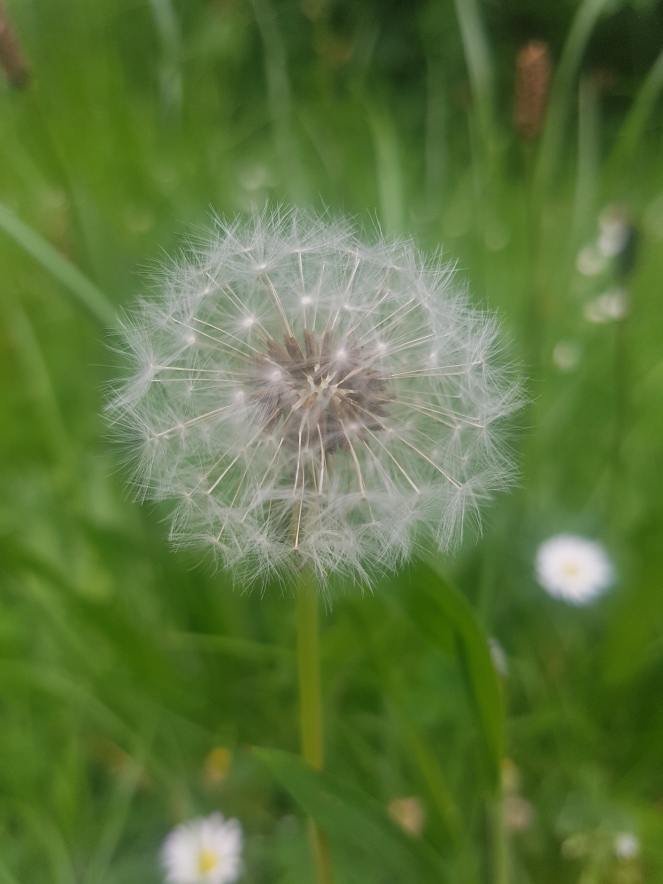
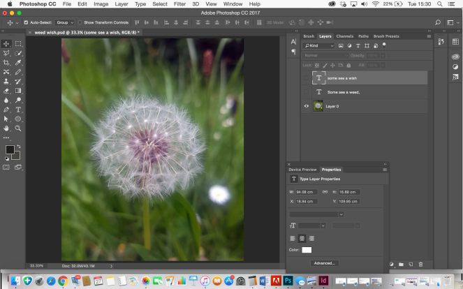
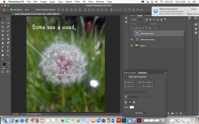
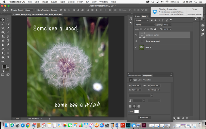
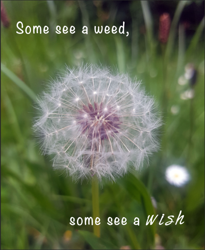
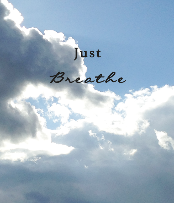
The message of the brief was to make the donor feel good and better about themselves for giving to people’s futures, either in ways of time, skills, products, money etc. The message of the pieces for my FMP charity campaign meet this need by including photographs and quotes to inspire this message, showing a visual combined with information through text, supporting and inspiring people of the key message.

In what ways does the visual communication/message of the piece fail to meet the needs of the brief?

My brief says about a lighthearted, fun approach – however the messages i used were more inspirational the fun.

What are the strengths of the visual communication? Why?

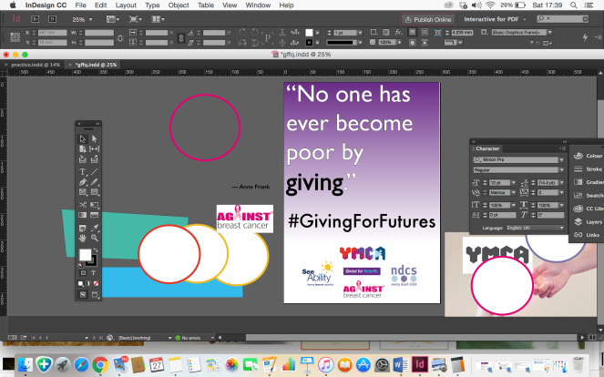
The strengths of the visual communication was the combination of image and text which helped bring the message alive and correspond with other charity campaigns. The font was prominent and easy to read from afar.

What are the weaknesses of the visual communication? Why?

More time could have been spent on the photographs themselves, improving quality.

In what ways could the piece be mis-read or mis-understood by the audience? Be specific about who the audience is.

The audience is everybody. Therefore it could be mis-read or mis-understood by people who have trouble reading. The call to action #givingforfutures could be mis-understood as the information explaining about this is on a webpage / social media.

In what practical ways could the piece be developed or improved?

The charity campaign could have been developed and improved by exploring more elements of charity campaigns, marketing, and mostly the webpage explaining more about the campaign and providing more information on the individual charities within the consortium, and things they could do to get involved.

2) Reflection of own working practices:
Be very honest with yourself in this section. Please feel free to approach a member of staff for help finding ways to develop skills.

How was my time keeping?

My time keeping for this project was hit and miss due to being unwell and having an extension. I feel it was not so much the time management but the value of the time was not the most productive, resulting in a smaller campaign then i had initially wished.

How was my analysis of the brief?

I felt i kept the brief quite open and covered the important factors of the elements, message, audience etc.

How was my research?

My research could have been more in-depth, covering more insight into other charity campaigns and questionnaires to people on their own experiences of giving.

How did I draw conclusions from my research?

Researching more than one avenue for the benefits of giving with supporting evidence and other professionals

How did I use research to generate and develop ideas?

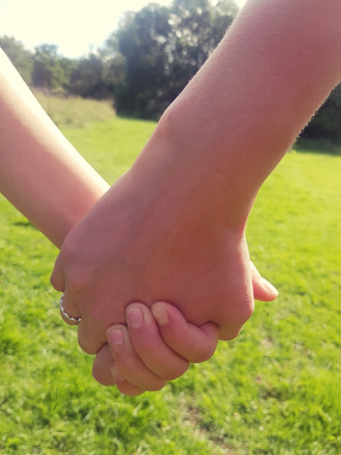
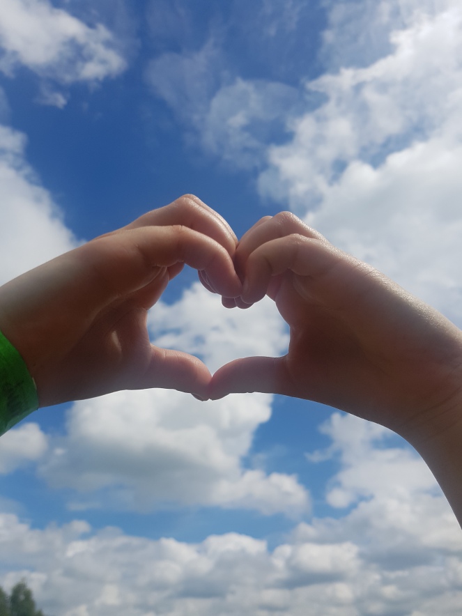
Originally i was going to base my design on a typographic piece, however my research brought to my attention how most charity campaigns use images to communicate with their audience, relating the message through human connections such as hands.

How did I use evaluations to help with my ideas generation and development?

Evaluating the importance of the message and being relatable to my audience, pushed me through to speak to tutors and ensure the message is clear in my design

How did I use experimentation during the project? How can I make this more effective?

I experimented with poster layouts, colour use, effective imagery, photography and type combined to match the meaning and not have the image take the meaning away from the text, or vice versa. I could have made this more effective by recording looking further into how images can take other meanings to different people.

In what ways did I show that I had achieved the Learning Outcomes? How can I improve this next time?

No set learning outcomes as written own brief.

What parts of the project did I enjoy most? Why was this the case?

I enjoyed researching about the benefits of giving and inspiration quotes to help portray this message to the audience.

What parts of the project did I enjoy least? Why was this the case?

I found working to my own brief a challenge, found myself questioning whether i had chose the write avenues for my brief.

At what times did I work best? Why might this be the case? How can I ensure that I work well at all times?

I feel once i had spoken to tutors about my worries and stage, i worked better because i had reassurance and guidance. Continuing this will help me work well and keep on track.

What areas inspired me? Why was this the case? How could I follow these up?

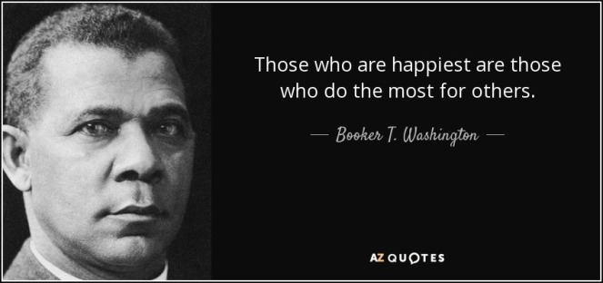
The famous quotes inspired me to make changes myself in the way i give my time and effort to others.

What areas were challenging or difficult?  Why was this the case?

The whole FMP i felt was a challenge. Especially having the 4 other projects to work on, distracted my attention from the FMP which made me feel i was behind which was hard to get back into. Being unwell gave me a massive set back on this project, even with the extension, the challenges of catching up were difficult.

How can I go about developing and improving  the parts I found difficult?

Getting back to full health. Learning to cope better with hopping from different projects and working hard on re-focusing by speaking to tutors and setting goals / planner to keep me on track.

Do I need to develop certain skills? Do I need these now? Or later?

Although my knowledge has come a long way, I need to continue to develop my skills using the design programmes. I want to develop my skills in web design and editorial spreads.

Any other points?


charity campaign · FMP · giving for futures

FMP – another poster design idea

I ran out of time to fully finish the design idea for this poster. I wanted to recreate the hand cupping, taking images of young hands with a painted heart on.

Cnmcr6kWAAAMNYZ

The first test images didn’t come out great due to shadows and lighting, so i cropped part of the hands and placed this onto the poster. I didn’t feel happy enough with the design to submit, with the lack of time i had, it wasn’t up to the standard of the others.


Screenshot 2017-06-16 09.28.45

charity campaign · FMP · giving for futures

FMP poster design 3 – Giving for Futures

Another great quote to sum up how giving to others comes back to us.

thursday

Sancha suggested showing an image giving a flower. I took these photographs of a childs hand giving a rose


I edited the image to improve the background and placed it behind the text. This image works well what the quote is saying.


Final design poster 3

Screenshot 2017-06-29 20.33.17.png


charity campaign · FMP · giving for futures

FMP Poster 2 – Giving for Futures

This quote supports the message of my campaign, that giving to others, whether it be there time, skills or money, makes you happy.

quote-those-who-are-happiest-are-those-who-do-the-most-for-others-booker-t-washington-46-48-83


I captured a rainbow outside my house and placed this behind the text to see if it worked. A rainbow can be symbolised as reflection and light after the rain. However i didn’t feel this image worked well with this quote. Causing confusion of meaning between text and image.


For this quote, i wanted to capture a connection between two people. Again i stuck to the hands theme and took this photograph of holding hands, representing a connection between two.

hands123

I added in the banner and logos with the same layout as before

Final poster 2 design

Screenshot 2017-06-15 22.36.08

Mock up

Screenshot 2017-06-29 22.25.23

charity campaign · FMP · giving for futures

FMP Poster design 1 – Giving for Futures

I researched quotes to add to my poster designs. They make a bold statement and make people think. I love this famous one by Anne Frank, which is very apt for my campaign.

Anne-Frank-Quotes-4

I started out using InDesign, adding in the quote and logos for Giving for Futures

Screenshot 2017-05-27 10.24.07Screenshot 2017-05-27 11.43.35

I created the #GivingForFutures banner as the call to action for my campaign, which will continue throughout the campaign

Screenshot 2017-06-29 18.34.41

At first, i experimented with the layout, a plain background to focus on the quote, logos and call to action

As each logo had a white background i thought how else i could position these with adding colour around them. I tried a circle effect, showing a visual of ‘linking’ of the charities

Screenshot 2017-05-27 12.07.02Screenshot 2017-05-27 17.39.20

Playing with background colour

I took this photograph to use as a background for my quote. From my research i felt the campaigns relating to charity marketing had more of an impact with an image. Hands are used a lot in campaigns to show meaning and relate to humans. The love heart is a symbol of love, kindness and giving.

20170530_150326

I played with the positioning of type and banner to see which layout had the most effect

Final Design Poster 1

Screenshot 2017-06-13 15.54.32

Mock up

Screenshot 2017-06-29 21.16.58

charity campaign · FMP · giving for futures

FMP research – Benefits of Giving

I looked into the benefits of giving online, watching videos and noting how kindness goes hand in hand with us feeling good

http://greatergood.berkeley.edu/article/item/5_ways_giving_is_good_for_you

Highlights

  • Giving makes us feel happy
  • Giving is good for our health
  • Giving promotes cooperation and social connection
  • Giving evokes gratitude
  • Giving is contagious


  • Kindness has a feed-forward effect
  • Kindness is all around us.

Giving for Futures – a nonprofit who believes small acts can have a big impact.
Will you join our community to create a kinder world?

Kindness

Giving makes us feel happy. A 2008 study by Harvard Business School professor Michael Norton and colleagues found that giving money to someone else lifted participants’ happiness more that spending it on themselves (despite participants’ prediction that spending on themselves would make them happier). Happiness expert Sonja Lyubomirsky, a professor of psychology at the University of California, Riverside, saw similar results when she asked people to perform five acts of kindness each week for six weeks.

https://greatergood.berkeley.edu/article/item/5_ways_giving_is_good_for_you

FMP

FMP progression

I had concerns about the typographic posters being too simple, not having enough impact. After having a conversation with Tim, he reassured me about my design choices, directing me to research graphic design such as VW- Think Small advertisement, and Drink Coke campaign which use type as a successful message.

Adding in the right image or illustration can be challenging to connect to the message and could have the potential to send out the wrong message.

The call to action is an important part of the campaign with the hashtag leading the audience to more information about the consortium. I spoke to Tim about an idea of having a digital advertisement on a billboard or bus stop which fades in and out a combination of the posters and also brings in pages of posts from people participating in the #givingforfutures campaign, sharing their stories of giving, adding in emotions from real people.


Bomb project · FMP · mindfulness · postcard

Mindful Postcard 2

I came across a dandelion seed head in the grass. Its seeds are like little parachutes that fly away with the wind, spreading and growing more dandelions. It can mean getting a wish fulfilled.

Known as a weed, it can grow practically anywhere there is soil or in the crack of a pavement.


Since the Dandelion can thrive in difficult conditions, it is no wonder that people say the flower symbolises the ability to rise above life’s challenges.

The saying ‘Some see a weed, some see a wish’ was apt for this mindful image.

The photograph i took focuses on the flower itself, fading out the background to highlight the definition in the seeds

20170523_154639

Standard postcard size – 148 x 105 mm

Screenshot 2017-06-27 15.30.25

I wanted a plain simplistic sans- serif typeface for the text, choosing Noteworthy. I emphasised the word ‘Wish’ by using Harabarahand, an Italic calligraphy font.


Screenshot 2017-06-27 15.30.27Screenshot 2017-06-27 15.30.29Screenshot 2017-06-27 15.30.43

Bomb project · FMP · mindfulness · Uncategorized

Mindful Postcard 1

Looking up at sky, seeing the suns rays highlight the clouds, made me feel calm, and aware of being in the present moment.

The clouds slowly moving have a therapeutic effect, which is what i wanted to capture in my photograph.

IMG_0712


Standard Postcard Size – 148 x 105 mm


Screenshot 2017-06-27 15.31.19

I thought about the text to compliment the image and reflect mindfulness. In that moment, ‘Just Breathe’ felt like a suitable phrase. Highlighting to remind yourself to clear your mind and just breathe for a while.

I used Callie Hand for the type of ‘Just’ because it is

For the word ‘breathe’ i wanted a carefree type with loose lines and a soft edge. I found this in Athelas.


Screenshot 2017-06-27 15.31.24

Final Design

postcard mindful

Bomb project · FMP · mindfulness · postcard

Mindful Walk

mindfulness
  1. the quality or state of being conscious or aware of something.
    “their mindfulness of the wider cinematic tradition”
  2. a mental state achieved by focusing one’s awareness on the present moment, while calmly acknowledging and accepting one’s feelings, thoughts, and bodily sensations, used as a therapeutic technique.

Being in Natures helps me practice meditation, being aware of every stop i take and the focusing on my breathing. Each step is slow, relaxed and calm.

I captured mindfulness through photographs on a nature setting woodland walk at different times of the day to capture different effects and emotions.

The air, the water, sunlight, patterns in reflections, textures and shadows all capture things i noticed on my mindful walk.