zine

Doodlers Anonymous – Zine research

Screen Shot 2015-11-04 at 11.19.08

I came across this website in research for designs of Zines.

It shares peoples doodle on almost anything they can find — pencil in a moleskine, marker on a napkin, ink on a torn receipt, sharpie on concrete.

This is a permanent home for spontaneous art. There’s a blog, interviews, themed-submissions and a lot of amusing thoughts on paper.

These ideas gave me inspiration for my own Zine
zine

Zine – Final Piece

12204491_10206198984188162_1278060981_o

This is our front and back cover of our Zine. We decided to use Red paper for the cover to make it bold and stand out.

The 3D Type on the front cover is hand drawn from stencils.

We used the back page as a subscription type page.

12197283_10206198983908155_1185095779_o 12193264_10206198983988157_62413936_o 12193213_10206198984028158_1397049913_o 12190756_10206198984108160_21453703_o 12190607_10206198984068159_2104467641_o

12194289_10206198983948156_75625246_o 12204366_10206198984228163_1543971011_o

We decided to produce our pages in black and white as we liked the natural retro zine feel. We achieved this by merging our pages together and photocopying them and folding them in the order we wanted the layout.

We chose the staple the pages together to bind them.

Typography · zine

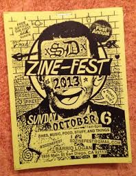
What is a Zine…

images        zine_birthday

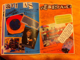
A Zine is a non profit self published book with an unpolished layout and unusual design.

Their contents can be anything and everything. They can communicate strong ideas of a typical Zine Culture like Punk or Feminists.

They are not looking for a broad audience or to appeal to everybody. The contents are bizarre, strange and quite personal.

Zines lack professionalism with rebellious words and personal rants.

images

Counter colture and underground press 1960-1975

Fanned by youths not wanting to accept the social, political Status Quo. During the Vietnam War they were reaching out to the community. Drugs could have had a possible effect on the design. Conventions for LP covers, music and posters. Typographic experiments.

Punk Zines

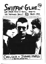
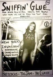
One of the first Punk Zines was by Mark Perry called ‘Sniffing Glue’ The style they used was collages, montages, ransom note lettering, assorted taboo imagery. Voice of the english working class generation alienated from class ridden culture.

Unknown-1 Unknown

zine

Group Discussion, Ideas for a Topic – Zine

We started using our divergent thinking process to brainstorm as a group about what topics we could use for our Zine and ideas for contents.

We all agreed we wanted to make it ‘tongue in cheek’ comedy theme.

Our first idea we came across for a topic is a humorous ‘Survival Guide’ for life without any digital communication from being wiped out from the Solar Flare.

Some of the ideas for the content included adverts, kids page, puzzles, lonely hearts section, recipes and different uses for digital appliances like computers and satellite navigation.

photo

Typography · zine

Zine – Design process

Survival Guide 4 Solar Flare – Design Process

As a group we thought it would be an idea to use maps as a theme because our Zine is a ‘survival guide’ and because it will make the pages look busy which is what we discovered the Zines were that we researched.

Maps are also very rarely used nowadays as we have things like Satellite Navigation and Technology to direct us, so i thought this fit quite well with our back to basics design.

We used pages from an atlas which also show lots of small different typefaces and numbers. We had 5 pages each to design and produce our own contents.

photo-2

We thought about our natural resources that we had to hand for producing the Zine without using any digital format.

The resources we used were Letraset stencils, stamps, hand writing and type collages from magazines

photo-3

photo 2

photo-4

photo 1 photo 2

For my 5 pages, i had the following themes to produce.

  1. Lonely Hearts
  2. Kids page
  3. Satellite navigation
  4. Collage advert
  5. Summary of Solar Flare

I researched the contents of my pages in magazines and tore out interesting letters and type that i could use in the Zine.

photo-5

I sketched my initial designs before putting them together to produce the final piece.

photo 1 photo 2 photo 3

Here is the images of my pages i designed for the Zine

photo 1 photo 2 1. Lonely Hearts – Even dating has evolved into the digital world with the likes of dating sites like Tinder. With the Solar Flare wiping this out, i designed my page to advertise going back to basics with old fashioned dating.

I spoke to my grandparents and asked them how they used to date without the use of these digital tools we have now. They spoke of how they would meet through friends and arrange blind dates – waiting under a clock with a flower so the other person could identify you.This is why i drew an illustration of the couple under the clock.

I tore out different type fonts out of magazines and hand wrote in an italic style writing for my content.

photo 3 2. Keep Calm and Carry on is a famous saying and advert that everyone knows and recognises. I felt this fitted in well with the panic of everybody loosing digital from the Solar Flare.

I used different type lettering to piece a variety of fonts together to create a collage effect.

photo 4 3. Everybody uses sat nav’s these days, and people very rarely pick up a map. I researched some old navigation techniques for my page (tongue in cheek) like looking for clues around you, trusting your instincts and reading the clouds.

photo 5 4. My kids page design was based on games kids could play outside with the loss of Wifi and electronic gaming systems like X-box and play-stations.

I used the digital like stencil for the numbers on the hop scotch to reflect that it can still be brought back-up-to date.

I cut out different type faces from comics that were bold and fun looking, and used hand writing to add in some more information.

I kept with the map theme and used an old fashion style map for the scavenger hunt idea.

Typography · zine

Evolution of Alphabets

The evolution of the Cuneiform character set.

Screen Shot 2015-11-03 at 19.44.08

Sumerian pictures evolved into syllabic symbols used by many languages for almost two thousand years before the Phoenicians developed the single-sound symbols we know as an alphabet.

The evolution of the Phoenician character set from the Proto-Sinaitic glyphs.

Screen Shot 2015-11-03 at 19.46.31

These are the pictographs found in the Sinai peninsula, ca. 1500 BC and are assumed to be the source of the sound symbols developed several centuries later by the Phoenicians.

The evolution of the Greek character set from the Phoenician character set.

Screen Shot 2015-11-03 at 19.49.49

The eventual evolution of the Arabic Character set from its Phoenician roots.

Screen Shot 2015-11-03 at 19.53.40

The Phoenician characters which in Greek rotated 90 degrees or the the non-symmetrical characters that flipped horizontally when the direction of Greek switched from left to right.

Screen Shot 2015-11-03 at 19.56.54

The evolution of the Square Aramaic/Hebrew character set from the Phoenician character set.

Screen Shot 2015-11-03 at 20.03.33

The evolution of the Modern Cyrillic character set from the Greek character set.

Screen Shot 2015-11-03 at 20.04.25

The evolution of the Latin character set.

Screen Shot 2015-11-03 at 20.07.09

Typography · zine

History and Evolution of Type – Hieroglyphics

I started my research going back to Ancient Egyptian times and looking at Hieroglyphics.The scribes of Egypt used three distinct scripts in their writing – Hieroglyphics, hieratic and demotic. The first Hieroglyphics were from 3100BCE.

Screen Shot 2015-11-03 at 18.53.39

Screen Shot 2015-11-03 at 18.53.56

Screen Shot 2015-11-03 at 18.54.05

They use to write different types of text on different surfaces, but as hieratic developed, hieroglyphics script became confined to mainly religious and monumental usage mostly carved in stone.Hieroglyphic inscription is arranged in columns or horizontal lines with no punctuation or spaces to indicate division of words.

Screen Shot 2015-11-03 at 18.54.17

Hieroglyphics signs were generally inscribed facing rightward and read from right to left. They were largely picture based with illustrations.

Hieroglyphic script also includes phonograms, sign-words for concepts that cannot be conveyed by a simple picture. The phonogram is best represented by the “rebus principle.” A rebus is a message spelled out in pictures that represent sounds rather than the things they are pictures of: for example, the picture of an eye, a bee and a leaf in English might be used to make the English sentence “I Believe,” or “eye-bee-leaf.” The sentence itself has nothing to do with eyes, bees or leaves.

zine

Analysis of Brief – Zines

I was very excited when i first heard about this brief about Zines. I love the idea as a designer to explore raw materials and going back to basics without the use of the digital world we have today.

The brief states that the project is about exploring lots of different Typography, Illustration, communication and mark-making which is really going to give us a chance to really express our creative ideas all combined into one project. I had never heard of a Zine before now, which makes this even more intriguing to me and the wonder of why i haven’t heard of this before…

In this brief we are to work in a group. In my group there are 3 of us all together. I really enjoy working in a group and bouncing off other peoples ideas. And this proved the case when my group started discussing topics for our Zine, we couldn’t get ideas down quick enough on the paper! Im excited to see how three different designers can come together to produce a final piece, showing each of their individual personalities in their designs. We discussed the first instructions on the brief which were to discuss and allocate pages, and decide on an Editor.We chose Ed Clarke to be our Editor, and set about allocating pages to ourselves so we knew what to go away and research and plan. We exchanged contacts and discussed a plan together to allow time for our Zine during reading week.