Based on the style of the layouts used in the magazine, i sketched out some ideas for possible layouts that would mirror the page layout design in the magazine. This is important to ensure that my design layouts does not compromise the overall style and flows with the other pages in the magazine.
I measured out the margins and gutter sizes and looked at the different articles covered.
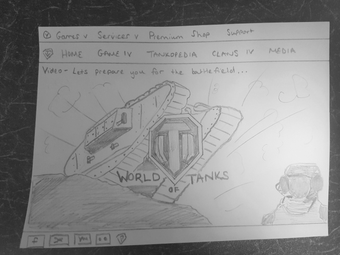
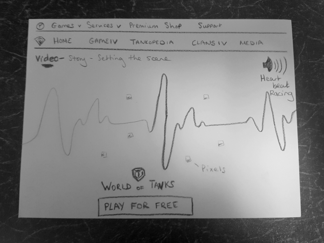
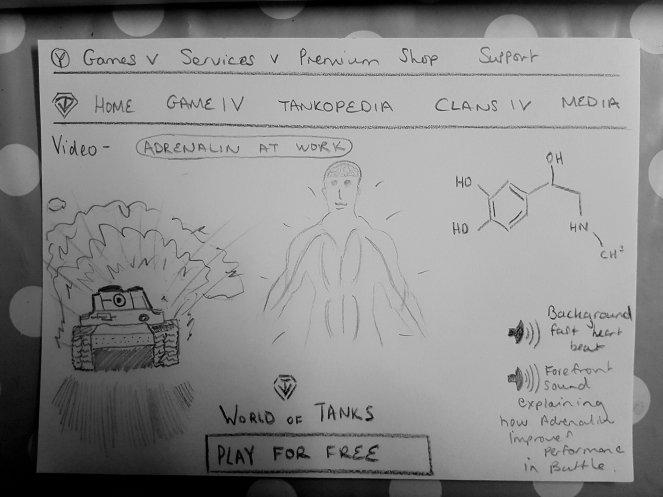
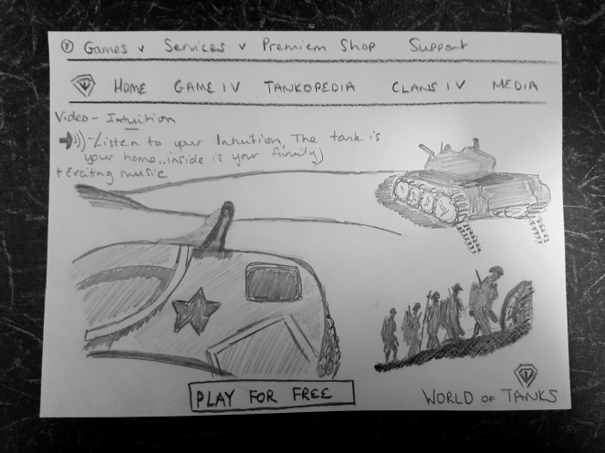
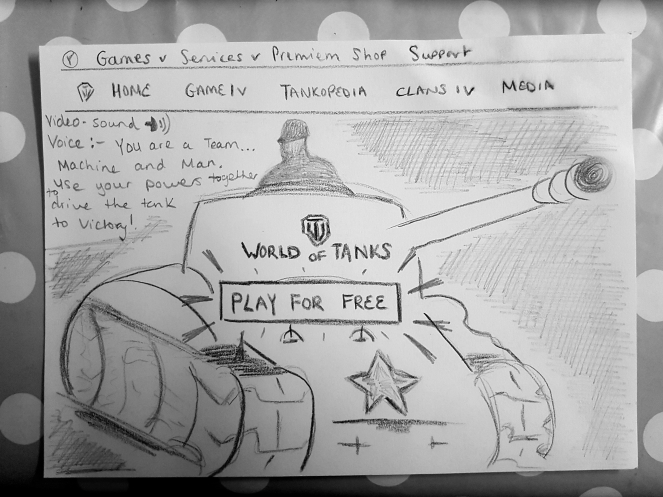
I sketched out ideas taken from inspiration from the world of tank website, showing a story board for the website homepage. My concept is to engage the user at first instance, using Experience Design – Cognition, Sensory perception and Emotion.I was trying to get into a mans head and how they feel about machinery. Having the power to control a machine excites them, brings an adrenalin rush. I thought combining real images from the war and placing them in the game would incorporate more meaning to people.
When i started sketching some ideas for Katie Price logo, i felt it was important to include her name in the logo and not just use an image due to how her current brands are and that it is representing her identity.
Embossing/Debossing
Embossing and dembossing are similar processes that create a different result. Both processes involve making a metal plate and a counter. The plate is mounted on a press and the paper is stamped between the plate and counter. This force of pressure pushes the stock into the plate, creating the impression.
Embossing produces a raised impression on your paper stock, while debossing creates a depressed impression.
Things to remember when designing for a piece that includes embossing/debossing:
Be aware that embossing is a mechanical process that manipulates the paper stock, so by default, it will also manipulate your design.
Set your type with more space between letters than usual. If you put them too close to one another, they can merge and become one element once the embossing has been done. Embossing makes design elements look smaller and reduces the sharpness of smaller items.
There are two ways you can emboss your work at home: dry embossing and heat embossing.
Dry embossing, also called relief embossing, is done by tracing a stencil with some paper over it with a special tool called a stylus to get the raised effect on it.
Heat embossing, also referred to as stamp and heat embossing, is done by stamping an image on a piece of paper, sprinkling powder over the stamped image, and then applying heat.
Varnish
A varnish is a liquid coating applied to a printed surface to add a clear glossy, matte, satin, or neutral finish. Here are the types of varnishes:
Varnish Type Description
Gloss Varnishing A gloss varnish gives the printed surface a glossy, sheen look.
Matte Varnishing A matte varnish gives the printed surface a non-glossy, smooth look.
Silk or Satin Varnishing A satin varnish gives the printed surface a neither a high gloss or matte, but the middle ground.
UV Varnishing Ultraviolet (UV) varnishing is a process for achieving an even more striking type of coating on your printed material.
All-over UV varnish Simply put, this is a UV seal applied all over the printed surface.
Spot UV Varnish A spot varnish is applied to chosen spots (areas) of a printed piece. This has the affect of highlighting and drawing attention to that part of the design.
Foil
To get the gold /silver stamp, a foil layer is affixed to a certain material by a heating process. It isn’t too complicated of a process and getting the files ready are quite similar to uv-spot printing. See my guide on preparing files for print as a reference and talk with your printer about how to supply the files. Foil printing normally requires vector images and/or outlined fonts of what you want to have stamped.
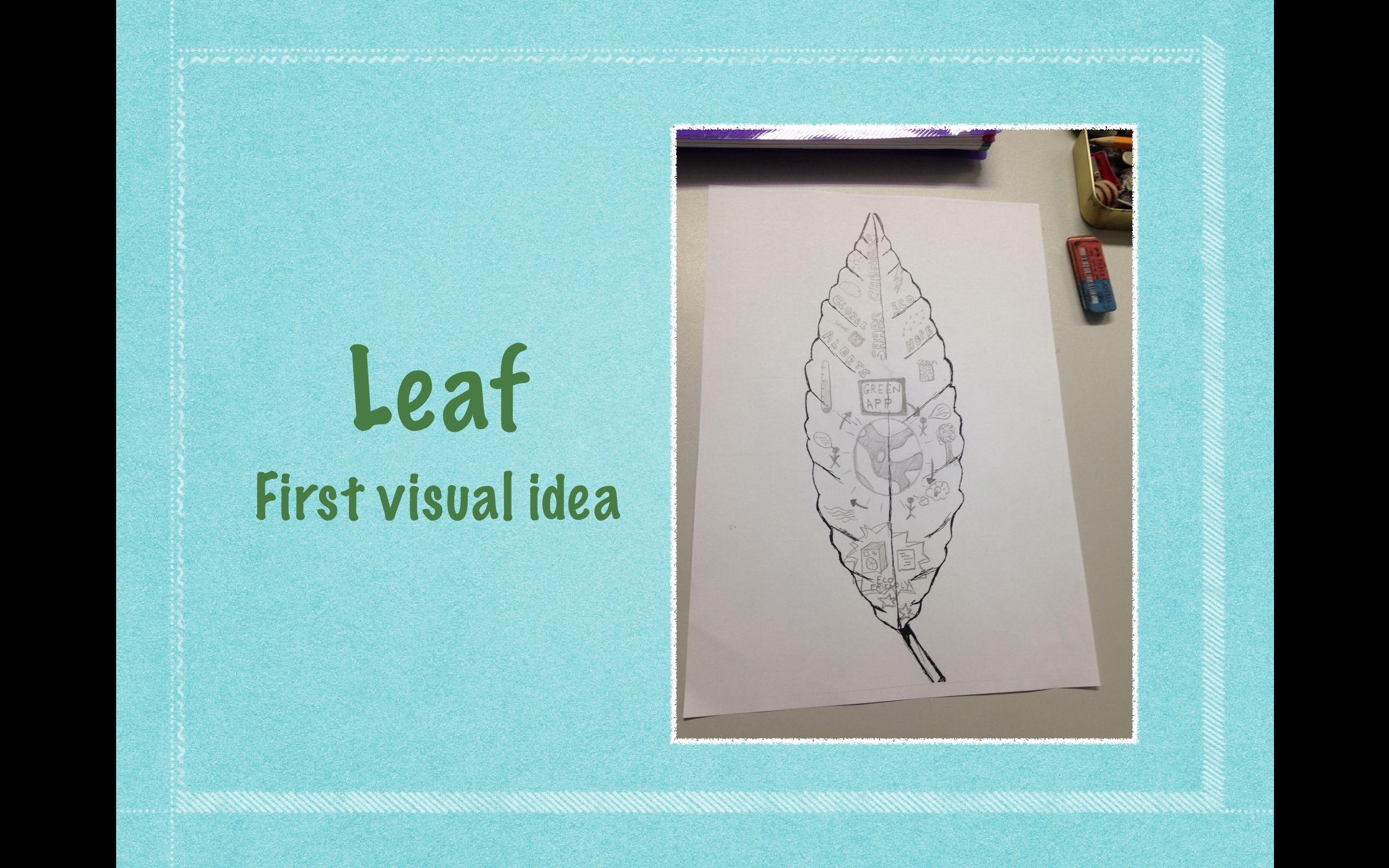
My first idea that i had for the design factory brief was an App to help people live GREEN, and help with climate change. Originally i was thinking of my target audience being the older generation, but after further research i decided to aim my design at the younger generation
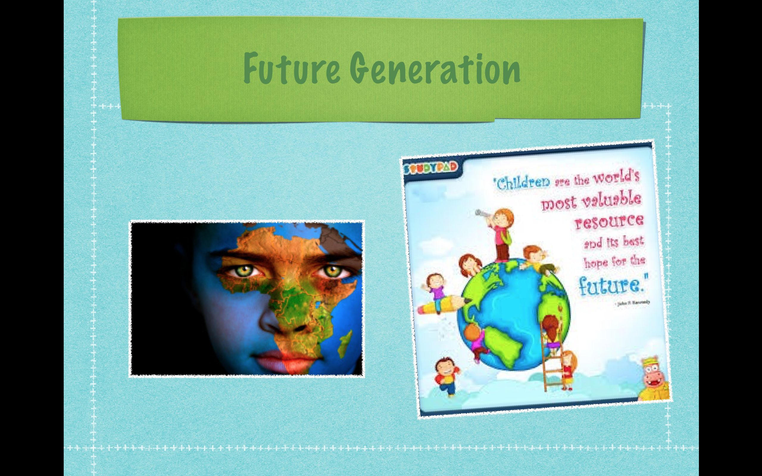
2. One of the most important factors of Climate change is educating people, helping them understand that they can make a difference. Our future generation rely on us to teach them and integrate the concepts into everything we do. They are excited to know what they ca do to help our planet.
3. At the design factory exhibition, one of the designs that inspired me for my design was the App for Mindful Shopping. The aim being to help shoppers make more informed choices about the products they purchase. Through simple layers of information, users can act on what matters to their health and the planet.
4. Thinking how my project could be more of an experience, i looked at the key elements. The first one being Cognition – making it easy to use by not over complicating it, knowing & understanding what they need to do and Educational, so they take in what they learn and apply it in real life.
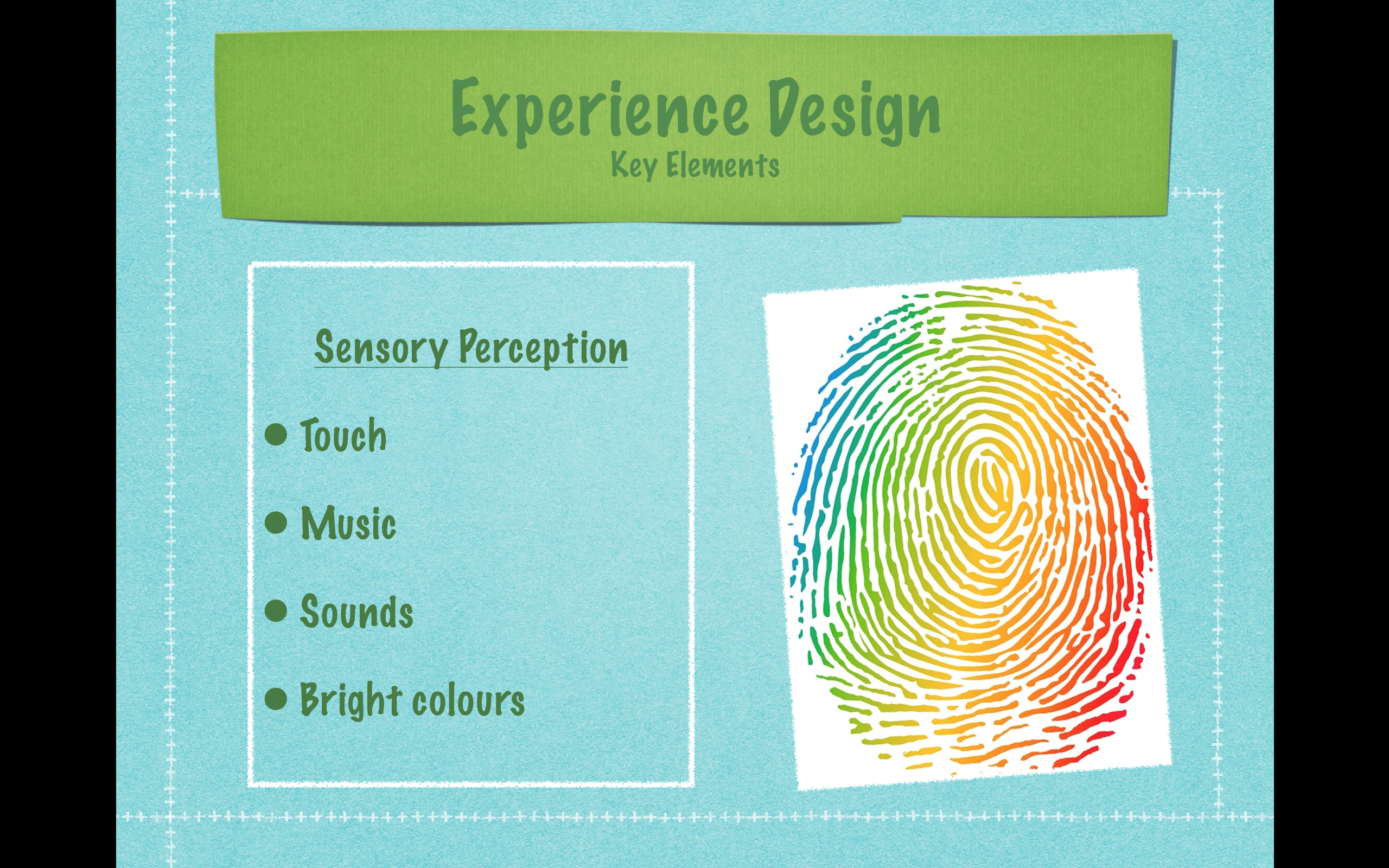
5. The next element i looked at was Sensory Perception. I like the idea of using this bright colourful fingerprint to open the app and other sections within the redirect as an indicator. This engages the user by touch. I also thought a magical sound when activated would add to the experience and talking from Eddie earth to engage the user.
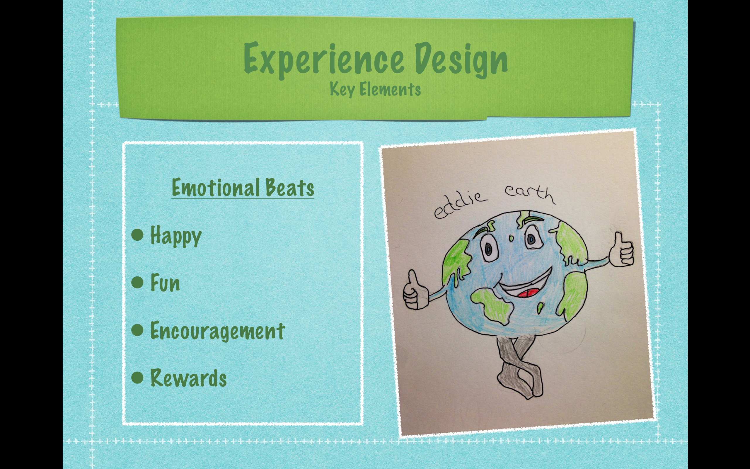
6. Eddie Earth is the icon for my app, he is happy, fun, encouraging and rewards the user to ensure the emotional beats are experienced in the product. Eddie earth will interact with the user, combining these elements with the idea of making learning about being GREEN, fun!
7. Joe here is who i am designing my app for- my typical audience. He enjoys learning about the planet, has access to the internet & Wifi and encouragement to live GREEN from his family. The app will be aimed at children of pre-school age between 3 and 6 years of age.
8. Parents, teachers and siblings are also part of my audience as they control if they will allow their children to use the app. Because it is educational, it will appeal to them in getting the message across to the children in a fun way. They can monitor their progress and praise them when they apply what they have learnt in the home.
9. People who could be excluded from my design would be like Ella here, who’s family cannot afford to have iPads and Wifi at home, or who’s family are not too interested in caring for the planet. In this instance, my App would be available in schools so Ella can still enjoy this product.
10. Here is a journey map of the user with my App design. It starts with the user feeling curious and opening the app, Eddie Earth is there to welcome them and show them around. They are kept engaged and taught how to be GREEN, they then apply it in the home and they are praised and rewarded by the parents.
11. Here are some of my thumbnail sketches showing how the layout could look in the app. The child can select a room in the house they wish to go in and it will take them to different lessons and questions by Eddie Earth. An Award will be presented and pop up on screen when they get the question right.
12. Eddie earths Eco-App is sustainable in the outcome of the product because children will be using and applying their new knowledge in everyday life. They will share this with their friends and family and set an example to their future generations, helping our planet.
C.S. Pierce was an American who also developed and extended the theory of Semiotics.
Part of his concept for the theory was that Signs can be divided into three differing types.
Icons. These are signifiers that have some sort of physical resemblance to the things that they signify. This category would include photographs, as they have a great deal of resemblance to the things in the photographs. Illustrations would also be counted (mostly) as Iconic Signs. But stick men would also be counted as Iconic as they do resemble the humans they signify. Rivers and roads on a map might also be included as they bear the same shape, simply scaled down. Spoken words that are onomatopoeias, such as “bang” and “whoosh” are iconic because the sound resembles the sound it signifies.
Iconic signs are relative, in that some are more iconic than others. In other words, some signifiers have more resemblance to their signifieds than others do.
Symbols. These are signs where the signifiers are learnt. They are cultural symbols that have no natural resemblance. This is what Saussure meant about signs being arbitrary. Most spoken language falls into the category of symbols because the words are cultural conventions, not instinctive noises.
Written words are always symbolic because letterforms, and indeed numbers and glyphs too are cultural conventions.
Indexes. Indexical signs are ones where the signifier can only exist because of the physical presence of the signified. These might include footprints, smells, animal or musical sounds, fingerprints. Indeed the clues in a detective story would nearly all be indexical signs – the lipstick trace on a wine glass or the blood stain on the weapon. And symptoms of illnesses are indexical signs too, because they only exist (perhaps in combination) with the presence of certain illnesses. Weather is also indexical of certain physical conditions in the atmosphere. Facial expressions and body language are indexes of mood. Smoke is an index of fire, steam of heat and so on.
Signifying practices are items that mark out difference, or tell the world “I use this to symbolise such and such”
Signifying practices are used to convey messages about ideology (the beliefs and assumptions of self and others).
The flapper stereotype is one of short bobbed or shingled hair, straight loose knee-length dresses with a dropped waistline, silk or rayon stockings with garters, heavy makeup, long beaded necklaces, and smoking. Flappers are also associated with Jazz and 1920’s dances like the Charleston.
I have chosen three items that act as a signifying practice within my youth subculture – Flappers
Jazz -The dancing Flapper and attire
The Headband – Feathers, pearls and precious jewels


 2. One of the most important factors of Climate change is educating people, helping them understand that they can make a difference. Our future generation rely on us to teach them and integrate the concepts into everything we do. They are excited to know what they ca do to help our planet.
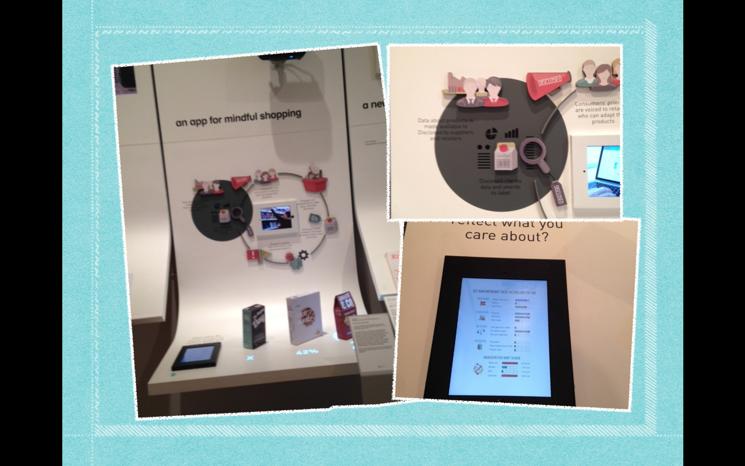 3. At the design factory exhibition, one of the designs that inspired me for my design was the App for Mindful Shopping. The aim being to help shoppers make more informed choices about the products they purchase. Through simple layers of information, users can act on what matters to their health and the planet.
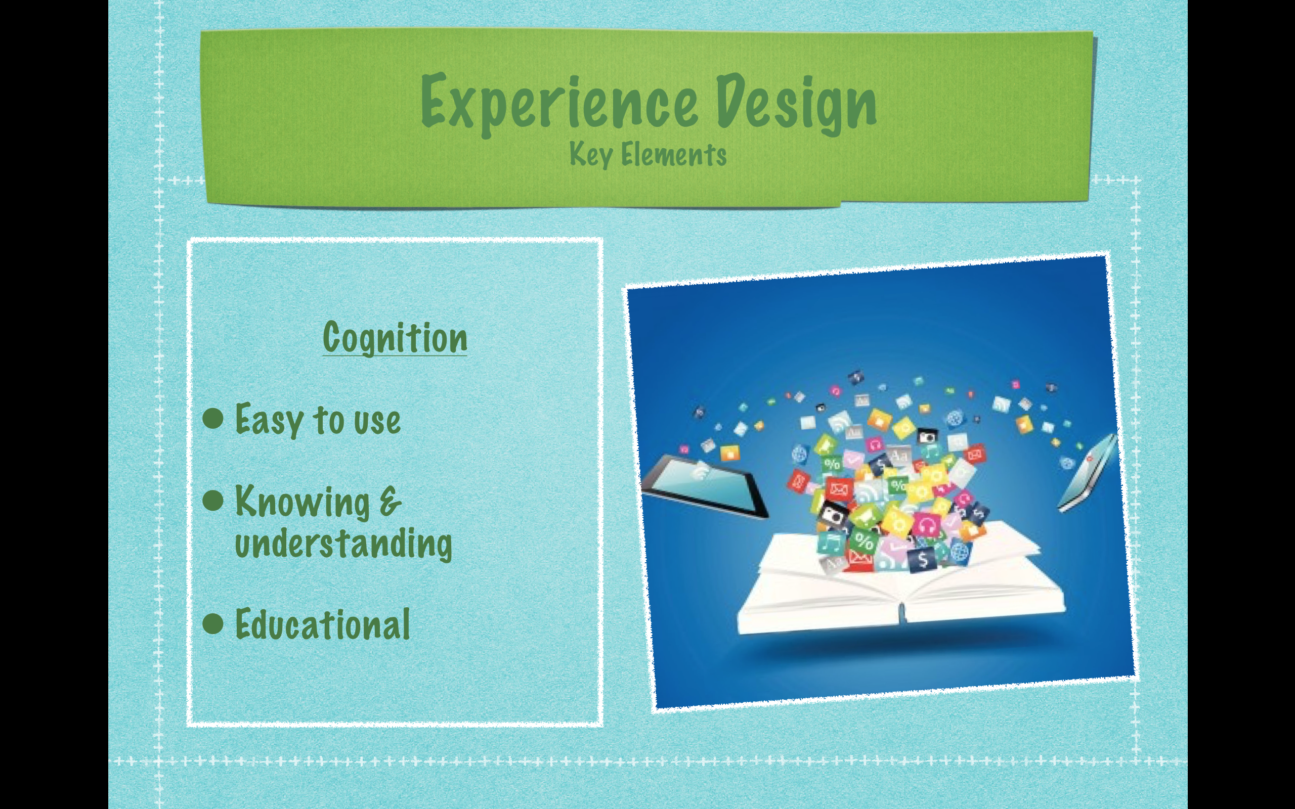
 6. Eddie Earth is the icon for my app, he is happy, fun, encouraging and rewards the user to ensure the emotional beats are experienced in the product. Eddie earth will interact with the user, combining these elements with the idea of making learning about being GREEN, fun!
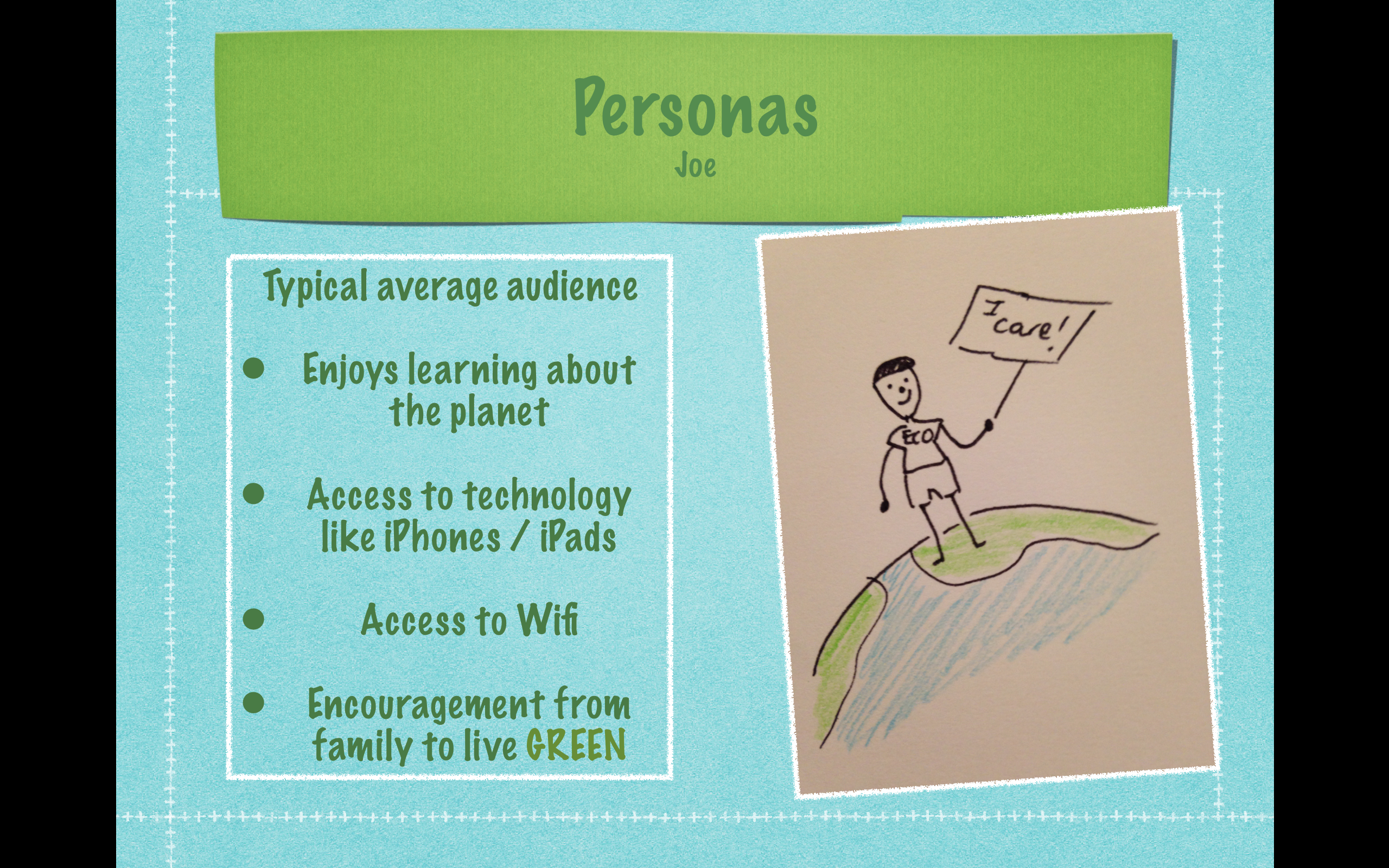 7. Joe here is who i am designing my app for- my typical audience. He enjoys learning about the planet, has access to the internet & Wifi and encouragement to live GREEN from his family. The app will be aimed at children of pre-school age between 3 and 6 years of age.
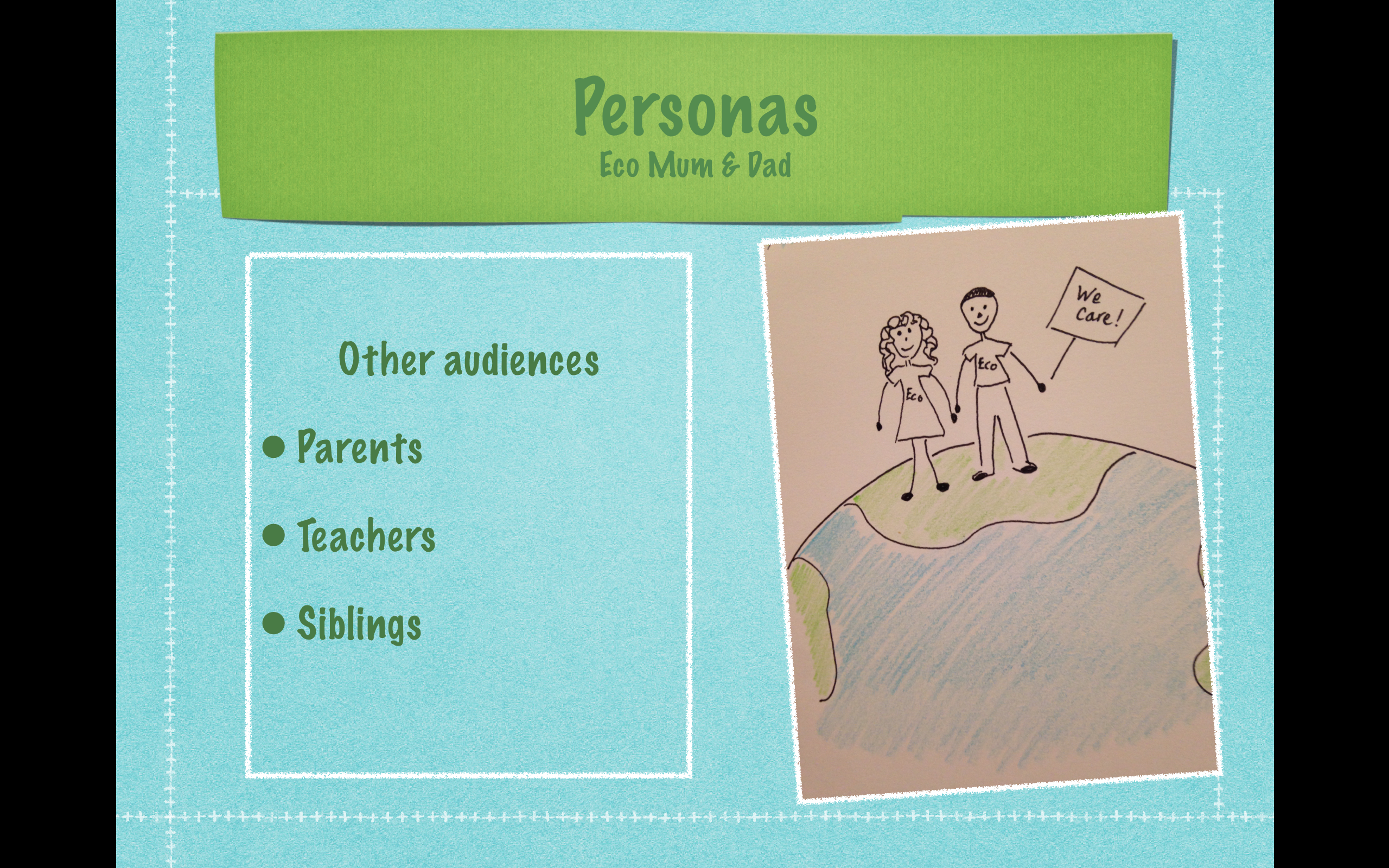 8. Parents, teachers and siblings are also part of my audience as they control if they will allow their children to use the app. Because it is educational, it will appeal to them in getting the message across to the children in a fun way. They can monitor their progress and praise them when they apply what they have learnt in the home.
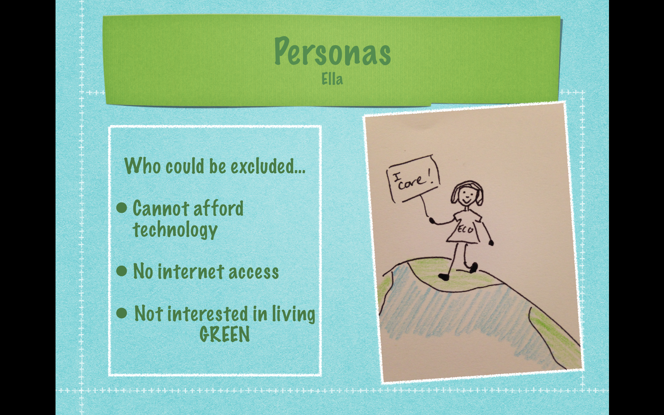 9. People who could be excluded from my design would be like Ella here, who’s family cannot afford to have iPads and Wifi at home, or who’s family are not too interested in caring for the planet. In this instance, my App would be available in schools so Ella can still enjoy this product.
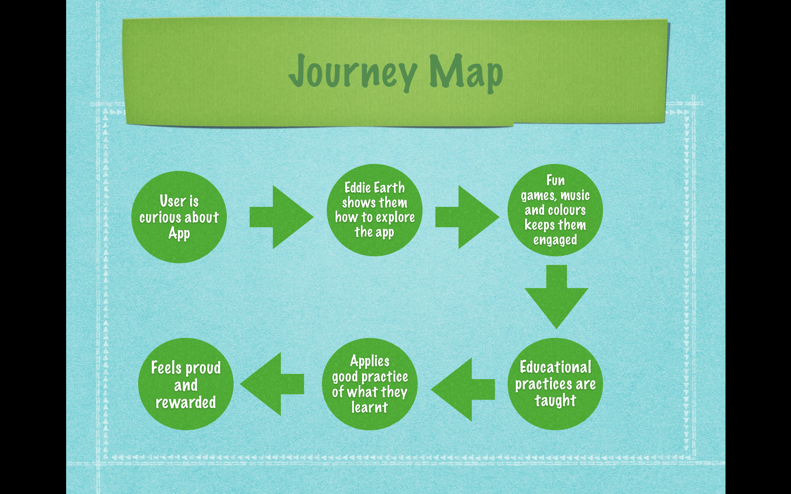 10. Here is a journey map of the user with my App design. It starts with the user feeling curious and opening the app, Eddie Earth is there to welcome them and show them around. They are kept engaged and taught how to be GREEN, they then apply it in the home and they are praised and rewarded by the parents.
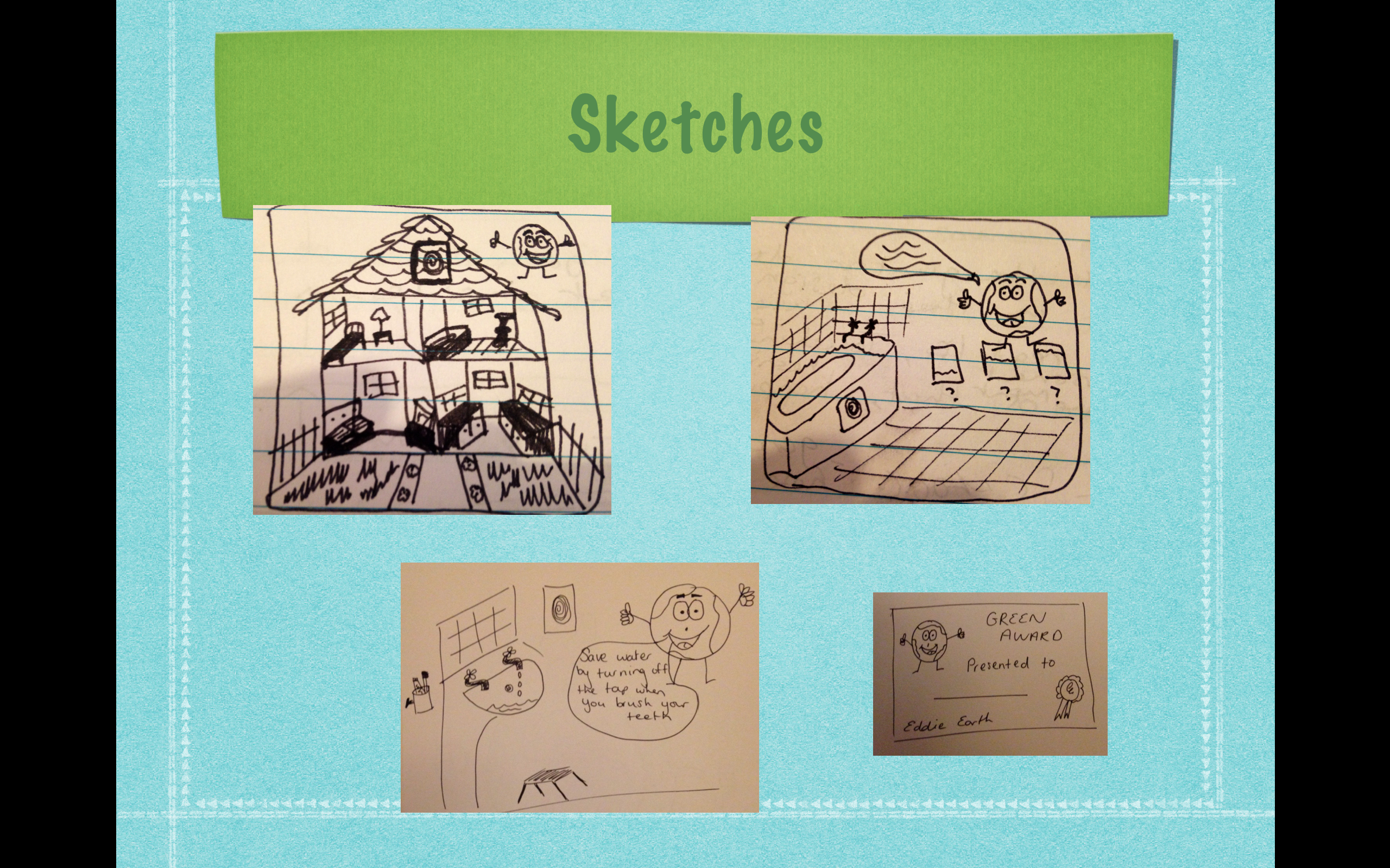 11. Here are some of my thumbnail sketches showing how the layout could look in the app. The child can select a room in the house they wish to go in and it will take them to different lessons and questions by Eddie Earth. An Award will be presented and pop up on screen when they get the question right.
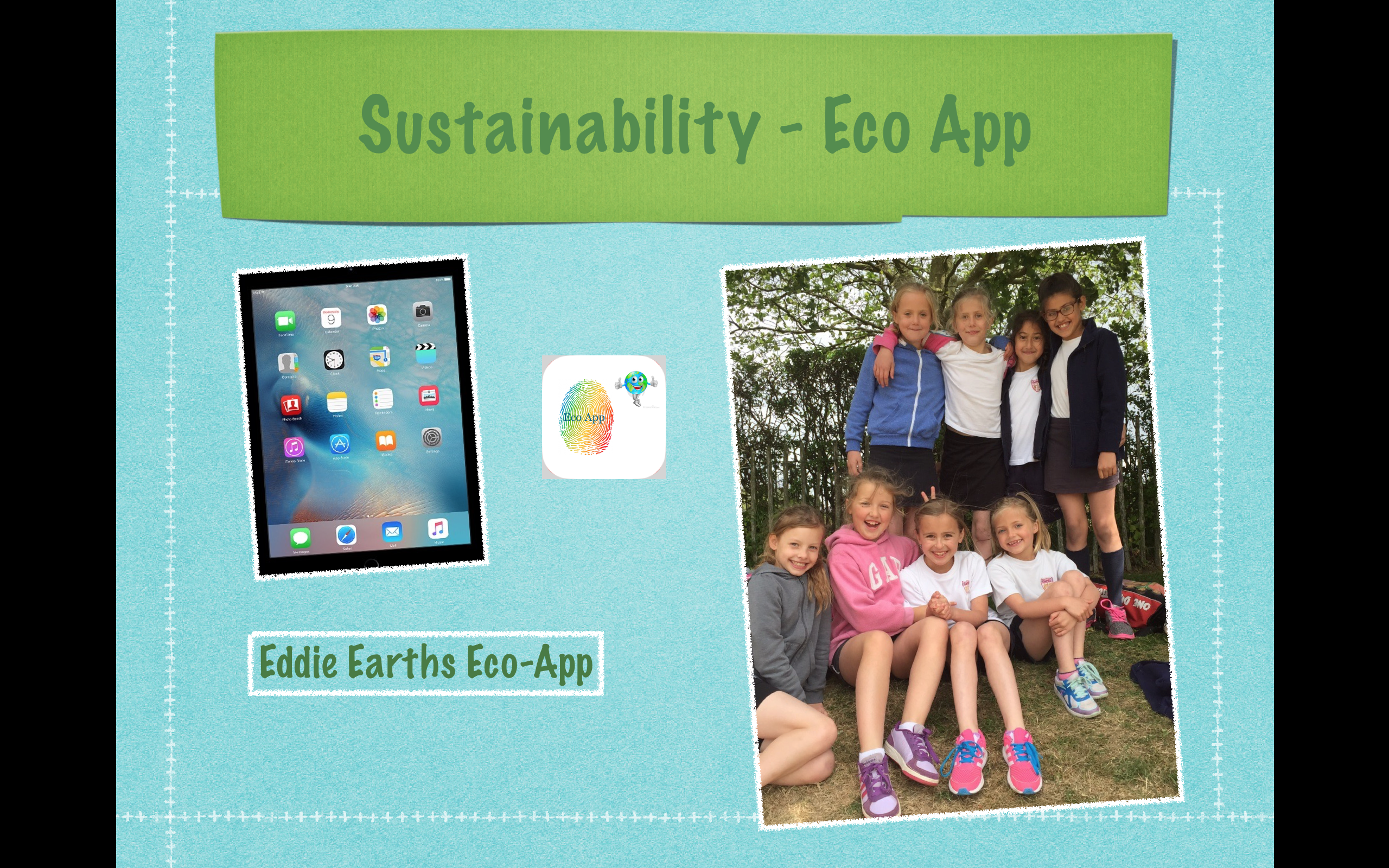 12. Eddie earths Eco-App is sustainable in the outcome of the product because children will be using and applying their new knowledge in everyday life. They will share this with their friends and family and set an example to their future generations, helping our planet.


