Type Technology — The
Four Revolutions
Gutenberg (ca. 1450-1480) & The Impact of Printing
 Before the printing press, books were produced by scribes (at first, primarily based in monasteries, although by the 12th century there were many lay copiers serving the university market). The process of writing out an entire book by hand was as labor-intensive as it sounds (try it some time): so much so that a dozen volumes constituted a library, and a hundred books was an awe- inspiring collection.
This remained true until the invention of movable type, the perfection of which is attributed to Johannes Gutenberg* (although the Chinese had it several centuries earlier, and a Dutch fellow named Coster may have had some crude form a decade earlier). Gutenberg, (Picture) although a man of vision, did not personally profit from his invention. He worked for over a decade with borrowed capital, and his business was repossessed by his investors before the first mass-produced book was successfully printed — the Gutenberg Bible of 1454, printed in Mainz by Fust* and Schoeffer*.
Gutenberg’s basic process remained unchanged for centuries. A punch made of steel, with a mirror image of the letter is struck into a piece of softer metal. Molten metal is poured into this, and you get type. The type is put into a matrix to form the page of text, inked, then pressed into paper.
Within several decades typesetting technology spread across Europe. The speed with which it did so is impressive: within the first fifty years, there were over a thousand printers who set up shops in over two hundred European cities. Typical print runs for early books were in the neighborhood of two hundred to a thousand books.
Some of these first printers were artisans, while others were just people who saw an opportunity for a quick lira/franc/pound. The modern view of a classical era in which craftsmanship predominated appears unjustified to scholars: there has always been fine craft, crass commercialism, and work that combines both.
To those who have grown up with television, radio, magazines, books, movies, faxes and networked computer communications it is difficult to describe just how much of a revolution printing was. It was the first mass medium, and allowed for the free spread of ideas in a completely unprecedented fashion. The Protestant Reformation might not have occurred, or might have been crushed, without the ability to quickly create thousands of copies of Luther’s Theses for distribution.
Many groups sought to control this new technology. Scribes fought against the introduction of printing, because it could cost them their livelihoods, and religious (and sometimes secular) authorities sought to control what was printed. Sometimes this was successful: for centuries in some European countries, books could only be printed by government authorized printers, and nothing could be printed without the approval of the Church. Printers would be held responsible rather than authors for the spread of unwanted ideas, and some were even executed. But this was a largely futile struggle, and most such restraints eventually crumbled in the western world.
Industrial Revolution
Steam, Line-casting & Automated Punch-cutting (start 1870-95; end 1950-65)
Amazingly, the printing press and the science of typecutting had only minor refinements from the late 1600s to the late 1800s. Towards the end of this period, the industrial revolution brought major innovations in printing technology. Rotary steam presses (steam 1814, rotary 1868) replaced hand-operated ones, doing the same job in 16 per cent of the time; photo-engraving took over from handmade printing plates.
Typesetting itself was transformed by the introduction of line-casting machines, first Ottmar Mergenthaler’s* Linotype* (1889), and then the Monotype* machine. Essentially, line-casting allowed type be chosen, used, then recirculate back into the machine automatically. This not only introduced a huge labor savings in typesetting, (again, on the order of the 85% reduction in printing time), but also rendered obsolete the huge masses of metal type created by the previously existing type foundries.While typesetting and printing speeds increased phenomenally, so did the speed of punchcutting*. In 1885, Linn Boyd Benton* (then of Benton, Waldo & Company, Milwaukee) invented a pantographic device that automated the previously painstaking process of creating punches. His machine could scale a drawing to the required size, as well as compressing or expanding the characters, and varying the weight slightly to compensate for the larger or smaller size — this last being a crude form of the optical scaling done by skilled typographers making versions of the same font for different sizes.
In optical scaling, the thickest strokes retain the same relative thickness at any size, but the thinnest strokes are not simply scaled up or down with the rest of the type, but made thicker at small sizes and thinner at large display sizes, so as to provide the best compromise between art and readability. (Linn Boyd Benton was also a type designer, and father of the prolific Morris Fuller Benton*, designer of dozens of faces including New Century Schoolbook. He managed manufacturing at ATF from 1892 until 1932, the year of his death.)
The economic impact of all these advances on the type industry cannot be overstated. For example, in the United States, the majority of type foundries escaped a bankruptcy bloodbath in 1892 by merging into a single company, called American Type Founders (ATF). Ultimately twenty-three companies merged into ATF, making it far and away the dominant American type foundry.
Also around this time, the “point”* measurement system finally reached ascendancy. In the earlier days of printing, different sizes of type had simply been called by different names. Thus, “Brevier” was simply the British name for 8-point type of any style. Unfortunately, these names were not standardized internationally; 8-point type was called “Petit Texte” by the French and “Testino” by the Italians. Such a naming system also allowed wonderful confusion, such as “English” referring both to blackletter type, and a 14-point size; “English English” was thus a 14-point blackletter*!
Pierre Simon Fournier* had first proposed a comprehensive point system* in 1737, with later refinements, but what was ultimately adopted was the later version developed by Francois Ambroise Didot*. This put approximately 72 points to the inch (and now exactly 72 points to the inch on most computer-based typesetting systems).
Photocomposition
(Intertype et. al., start 1950-60, end 1975-85)
The first photo composition devices (the French “Photon” and Intertype‘s Fotosetter) made their debuts as early as 1944, but didn’t really catch on until the early 1950s. Typeface masters for photocomposition (Phototypesetting) are on film; the characters are projected onto photo-sensitive paper. Lenses are used to adjust the size of the image, scaling the type to the desired size. In some senses this technology was an “improvement,” allowing new freedoms, such as overlapping characters. However, it also pretty much eliminated optical scaling (see 2.2, above), because in the rush to convert fonts to the new format, usually only one design was used, which was directly scaled to the desired size.
Digital (start 1973-83)
The earliest computer-based typesetters were a hybrid between the above-mentioned photocomposition machines and later pure digital output. They each had their own command language for communicating with output devices. Although these machines had advantages, they also had problems. None of these early command languages handled graphics well, and they all had their own formats for fonts. However, some of these devices are still in service as of 1995, for use in production environments which require more speed and less flexibility (phone books, newspapers, flight schedules, etc.).
In the late 1980s PostScript*, developed by John Warnock* Charles Geschke*, gradually emerged as the de facto standard for digital typesetting. This was due to a variety of reasons, including its inclusion in the Apple Laserwriter printer and its powerful graphics handling. When combined with the Macintosh, the first widely used computer with a what-you-see-is-what-you-get display (WYSIWYG*) and PageMaker* (called the first desktop publishing program), the seeds were all sown for the current dominance of computer-based typesetting.
A portion of the high-end typesetting still involves printing to film, and then making printing plates from the film. However, the increasing use of high-resolution printers (600-1200 dots per inch) makes the use of actual printing presses unnecessary for some jobs. And the next step for press printing is the elimination of film altogether, as is done by a few special systems today, in which the computer can directly create printing plates.
Today, although PostScript predominates, there are a variety of competing page description languages (PostScript, HP PCL, etc.), font formats (Postscript Type One and Multiple Master*, Truetype* and Truetype GX, and today’s Open Type*) computer hardware platforms (Mac, Windows, etc.) and desktop publishing and graphics programs. Digital typesetting is commonplace, and photocomposition is at least dying, if not all but dead. Digital typefaces on computer, whether Postscript or some other format, are generally outline typefaces, which may be scaled to any desired size (although optical scaling is still an issue).
There has been considerable economic fallout from all this in typography. Although some digital type design tools are beyond the price range of the “average” user, many are in the same price range as the mid- to high-end graphics and desktop publishing programs. This, combined with the introduction of CD-ROM typeface collections, has moved digital type away from being an expensive, specialized tool, towards becoming a commodity. As a result of both this and the brief photocomposition interregnum, the previously established companies have undergone major shakeups. Major vendors, such as American Type Founders, have failed to successfully make the digital transition, and gone bankrupt instead (although at this time ATF has undergone a resurrection). More recently, even major digital type foundries have –dare one say foundered?– on the shoals of ubiquitous cheap typefaces.
Although there is a new accessibility of type design tools for hobbyists and professional graphic artists, the decreasing value of individual typefaces has resulted in a decrease in the number of working type designers per se (both independents and company-employed).


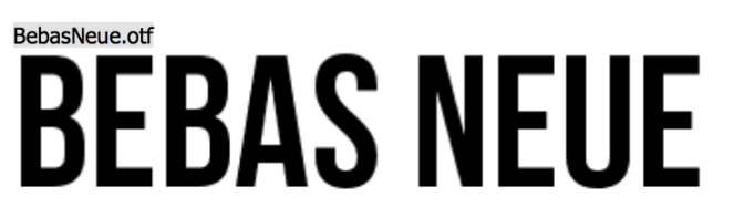 The Bebas Neue typeface is a sans serif font family,clean lines and straightforwardness making it a good type for Print. However i think the type face is quite serious and the Ethics poster needs a softer typeface.
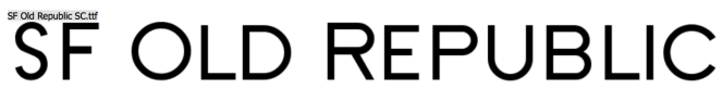
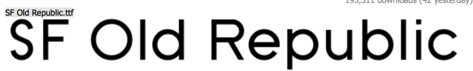 The SF Old republic typeface is a clean and simple sans serif. It has a softer approach then Bebas Neue and works with both Capital and lower case letters. The only letter i didn’t like was the Y as it looks too angled. The type face is clear and works well on an informative poster. The combination of Capital letters in the Title and the lower case text meant that further typefaces didn’t have to be used, however it could be a design development to include another typeface to add to the over all effect of the infographic poster.