Good layout designs
Columns have been used on a grid to create a balance and order on this spread. The use of white bold text on the dark background makes the heading stand out.

The images are clear and symmetrical. The space allows the photographs to stand out in their own right.

Bad layout designs
Designing the body copy on the spread to be at an angle makes the article hard for the reader to read. It works with bolder text as it is readable on the left hand side but not in small paragraphs.

The text over this makes the article hard to read and ruins the image behind. The colours fade into the page and the red hurts my eyes!

Learning about Good & Bad Layouts
Magazine spread is two pages that are next to each other. Each spread works as one unit. It is not two pages separated but two pages that work together to create one unit. When designing magazines it is vital to look at these two pages as one single element even if those pages are going to contain two different stories. Because of this you have to consider what will be on the other side of your spread. Will it be an ad, will it be beginning of another story or maybe full bleed image.
You should place your best content on the outside parts of the spread. These are the areas that are most seen. This is the place to put most provocative images and words. Put the best stuff where it will be most visible and where it will make the best impact. Most valuable areas of page spread are top left and top right parts, because when you skim through the magazine these are the areas where you look the most.
THE MOST VISIBLE PARTS OF A SPREAD ARE OUTER UPPER PARTS
Sometimes headline can go on the bottom part of the page if this pages has full-page image that bleeds out of the page.


Keep the flow of the text columns tidy and even.Things should be simple, and you should simplify the design by aligning the columns at the top and placing images above them. In this way reader will have no problem to follow the text part of the story.

Photography Magazine Layout ideas and inspiration that i researched online
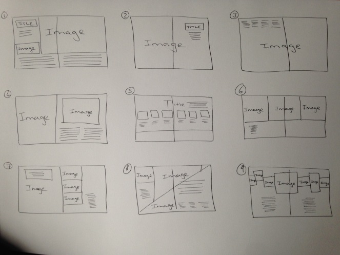
From my research i sketched out some layout ideas of my own
http://www.magazinedesigning.com/magazine-spreads-good-bad-practices/


