Double page spreadx4 · Editorial Design · Magazine · summer spreads

Spread 4

I included a spread on the vintage mens underwear. The images of the male manikin and boxer shorts were photographs from the postcards at the exhibition and the other is a found image from the online article.

Sketch

20170618_110143

I continued to work to the grid and measurements from the previous pages

Screenshot 2017-06-18 13.51.17Screenshot 2017-06-18 13.51.19

I kept the text small for this spread, just anchoring the images from their descriptions.

Screenshot 2017-06-18 15.56.02

Final design of male underwear spread

Screenshot 2017-06-18 21.00.27

Double page spreadx4 · Editorial Design · Magazine · summer spreads

Spread 2

I used the three photographs below for the next spread, carrying on with the same article. The 2 photographs on the left were my own from the exhibition and the one on the right, a found image online from the exhibition website


I used the write up from the exhibition to describe the images


20160824_121526

The grid continues from the previous spread. I mirrored the first spread layout by creating the opposite positioning of the images and type.

Screenshot 2017-06-18 17.53.21

Final design of second spread

Screenshot 2017-06-18 21.00.44


Double page spreadx4 · Editorial Design · Magazine · summer spreads

Spread 1

20170618_110137

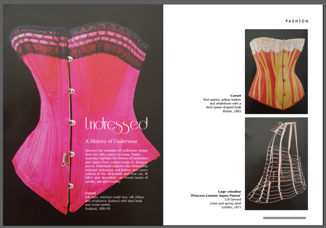
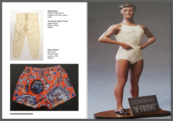
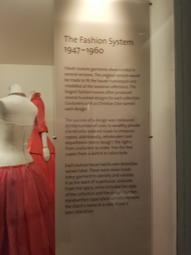
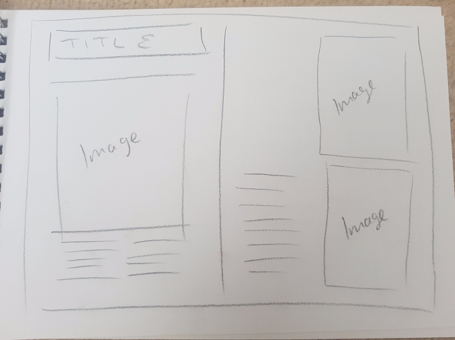
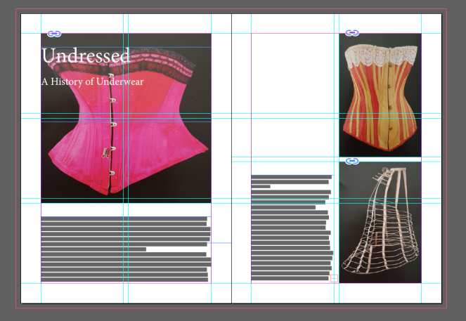
I chose the three images i took of the postcards below for my first spread as a fashion article

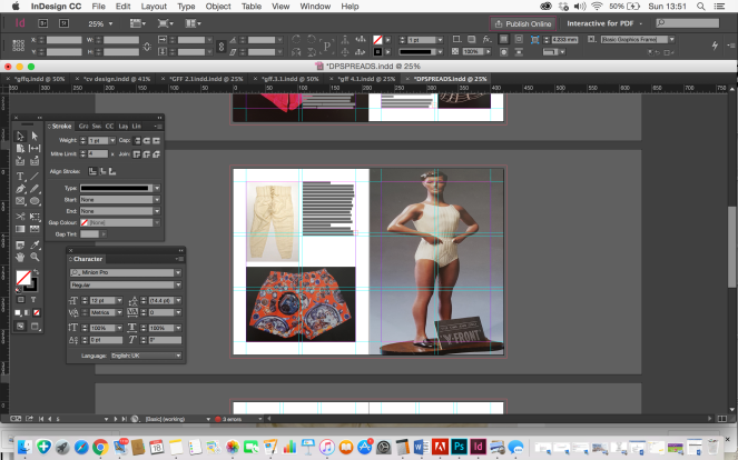
I created a grid and insert the correct measurements for the borders and gutter from my magazine

Screenshot 2017-06-18 12.33.58

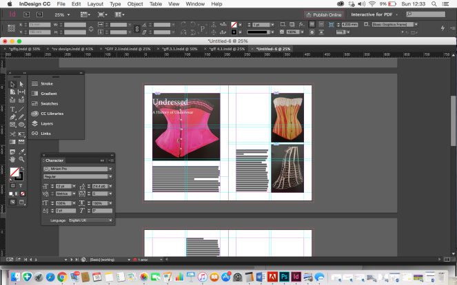
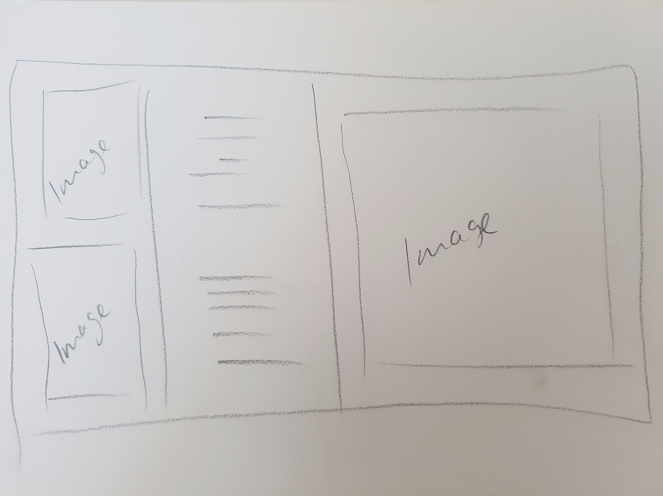
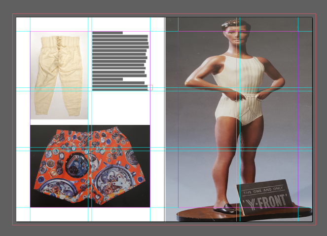
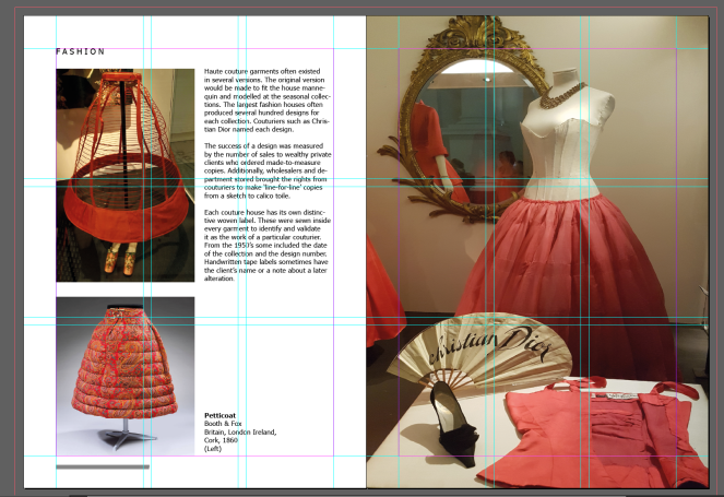
I started out placing the elements of image and placeholder text in the layout of my sketch

Screenshot 2017-06-18 12.34.12

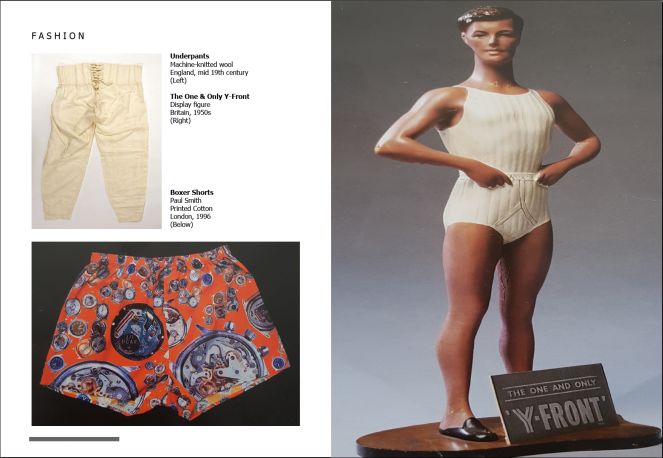
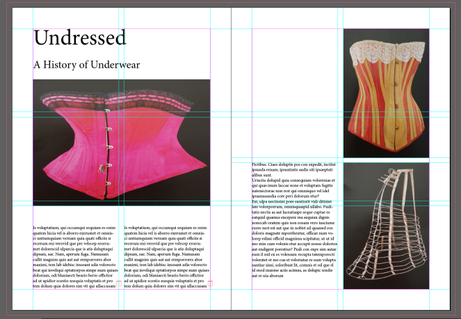
I added in the title and straight away i could see i wanted to see if it could work as a better design layout

Screenshot 2017-06-18 12.44.49

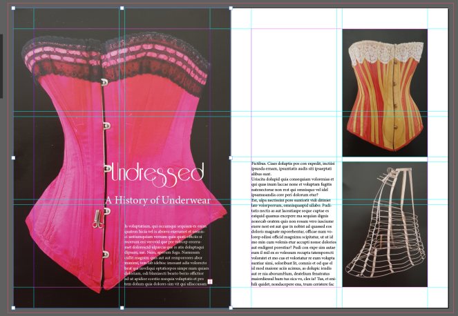
I changed the image to fit the first page and moved the title and subtitle of the article over the image. I researched for a vintage typeface for the title, choosing a downloaded font called – Riesling.

The subtitle i chose a serif typeface to compliment the title font – Athelas

Screenshot 2017-06-18 13.07.29Screenshot 2017-06-18 13.10.07

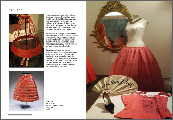
As i was using the description from the back of the postcards about the products, i decided to separate the text column on the right page to anchor each image

Screenshot 2017-06-18 13.15.15

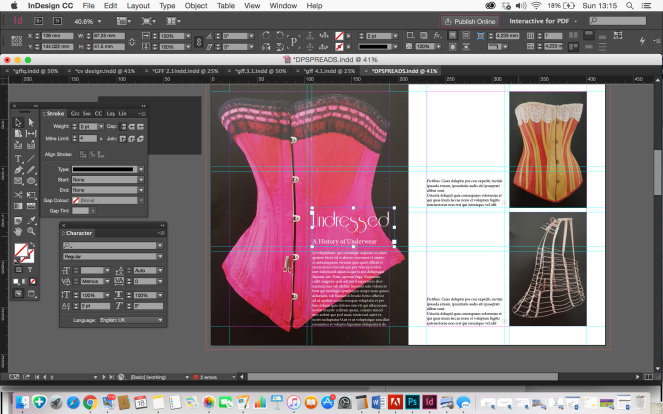
The vintage magazine had the named section of the article in which it fits in on the top corner of the page and the bottom of the pages has the magazines website and page number. I studied the typeface and chose ‘Tahoma’ to be the most similar and amended the spacing and size of the text accordingly.

Final design page spread 1

Screenshot 2017-06-18 15.42.11

Double page spreadx4 · Editorial Design · grids · ideas · Magazine · Page layout · sketches · Vintage

Sketches / ideas

Based on the style of the layouts used in the magazine, i sketched out some ideas for possible layouts that would mirror the page layout design in the magazine. This is important to ensure that my design layouts does not compromise the overall style and flows with the other pages in the magazine.

I measured out the margins and gutter sizes and looked at the different articles covered.

20170618_110137

20170618_110143

20170618_110148

20170618_110152

Double page spreadx4 · Editorial Design · Magazine · Vintage

Chosen Magazine for spreads

My chosen magazine for my 4 double page spread designs will be for a Vintage Magazine called ‘Her Vintage Life’

This magazine fits the brief by not measuring an A size and being my chosen topic of interest. I like the range of topics that can be covered in this magazine, which will allow me to choose different content for my spreads.

Size 21cm / 29cm

Important elements to consider for designing my spreads:

  • Grid layout
  • Columns
  • Imagery & Text
  • Style
  • Target Audience


20170623_142844

20170623_142926.jpg