
The 4 double page spreads finals
Design Portfolio
The 4 double page spreads finals
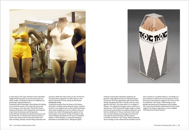
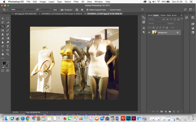
The photograph i took of the vintage swimwear came under their underwear section. I uploaded to photoshop and edited the image to remove the tennis sportwear.
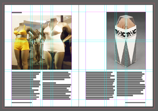
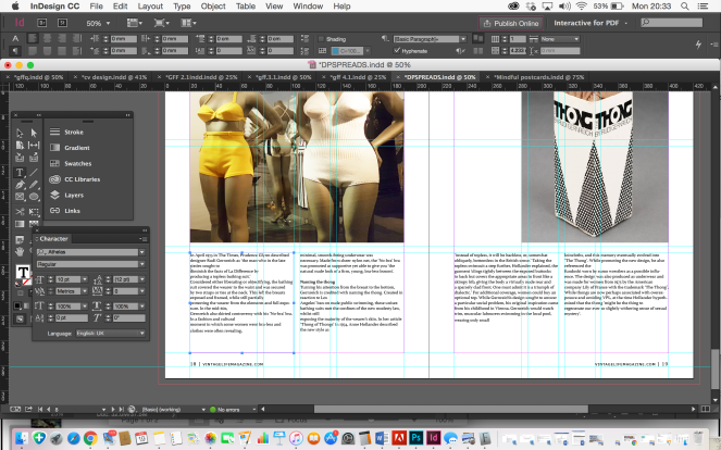
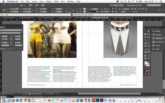
From the V&A article i used the thong box image and copy of text to include in this spread.
https://www.vam.ac.uk/articles/the-thong


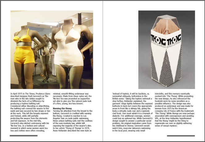
Final design of 3rd spread
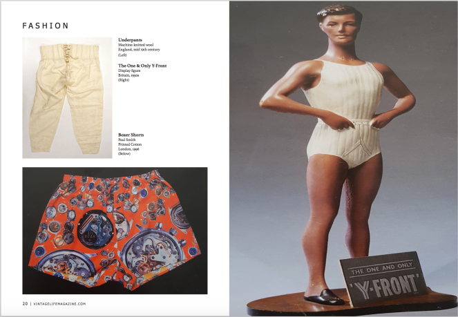
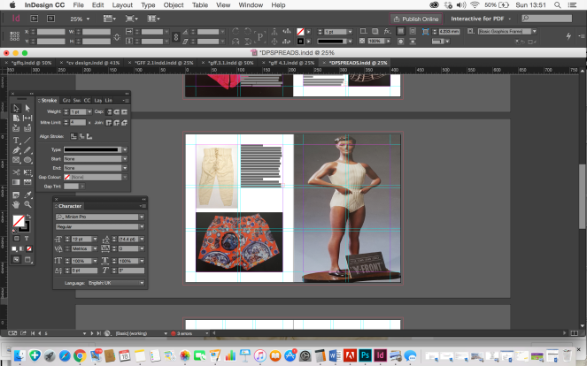
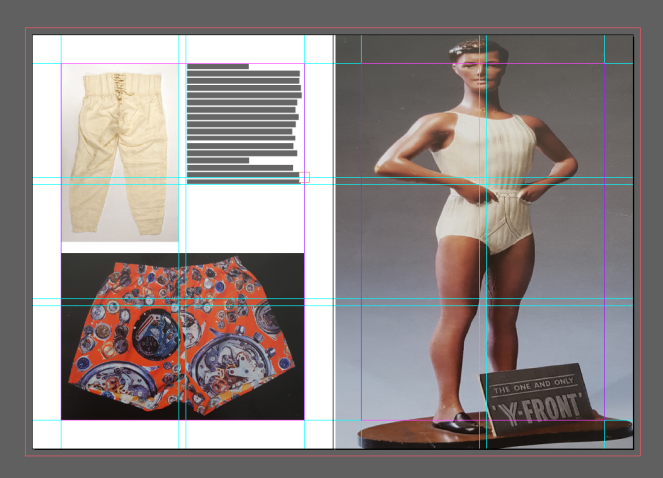
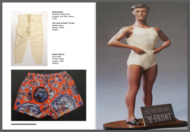
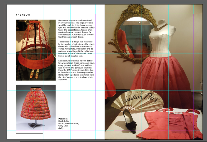
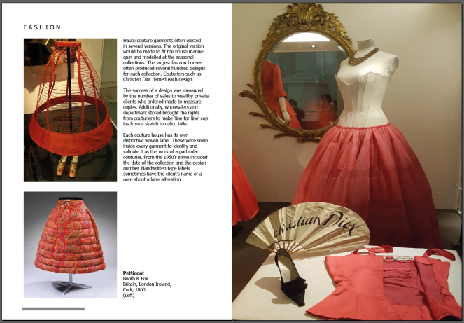
I included a spread on the vintage mens underwear. The images of the male manikin and boxer shorts were photographs from the postcards at the exhibition and the other is a found image from the online article.


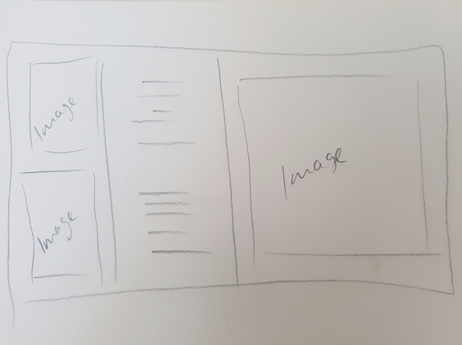
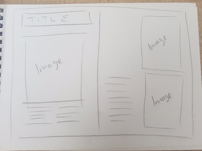
Sketch
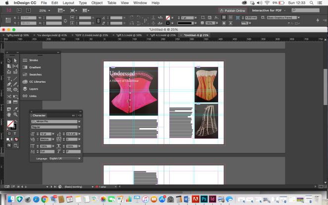
I continued to work to the grid and measurements from the previous pages
I kept the text small for this spread, just anchoring the images from their descriptions.
Final design of male underwear spread
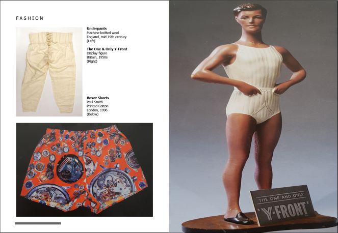
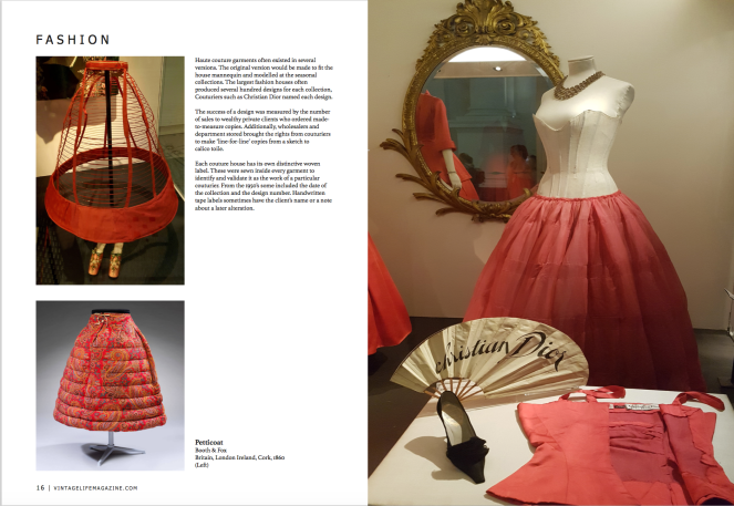
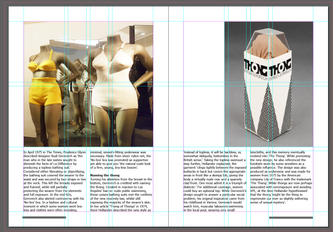
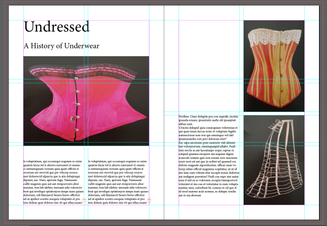
I used the three photographs below for the next spread, carrying on with the same article. The 2 photographs on the left were my own from the exhibition and the one on the right, a found image online from the exhibition website


I used the write up from the exhibition to describe the images
The grid continues from the previous spread. I mirrored the first spread layout by creating the opposite positioning of the images and type.
Final design of second spread
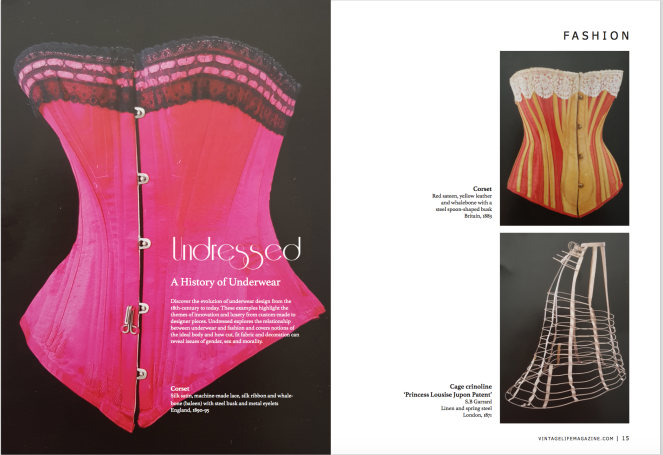
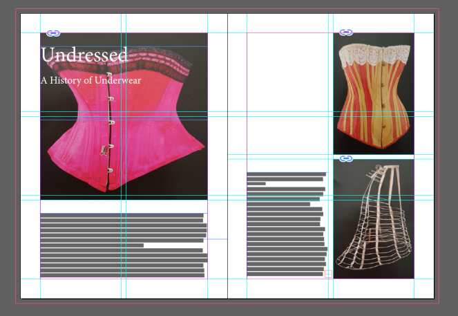
I chose the three images i took of the postcards below for my first spread as a fashion article


I created a grid and insert the correct measurements for the borders and gutter from my magazine
I started out placing the elements of image and placeholder text in the layout of my sketch
I added in the title and straight away i could see i wanted to see if it could work as a better design layout
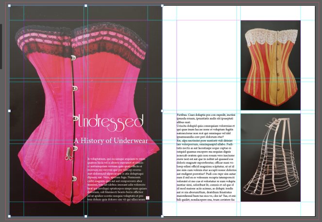
I changed the image to fit the first page and moved the title and subtitle of the article over the image. I researched for a vintage typeface for the title, choosing a downloaded font called – Riesling.
The subtitle i chose a serif typeface to compliment the title font – Athelas

As i was using the description from the back of the postcards about the products, i decided to separate the text column on the right page to anchor each image
The vintage magazine had the named section of the article in which it fits in on the top corner of the page and the bottom of the pages has the magazines website and page number. I studied the typeface and chose ‘Tahoma’ to be the most similar and amended the spacing and size of the text accordingly.


Final design page spread 1
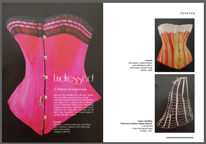
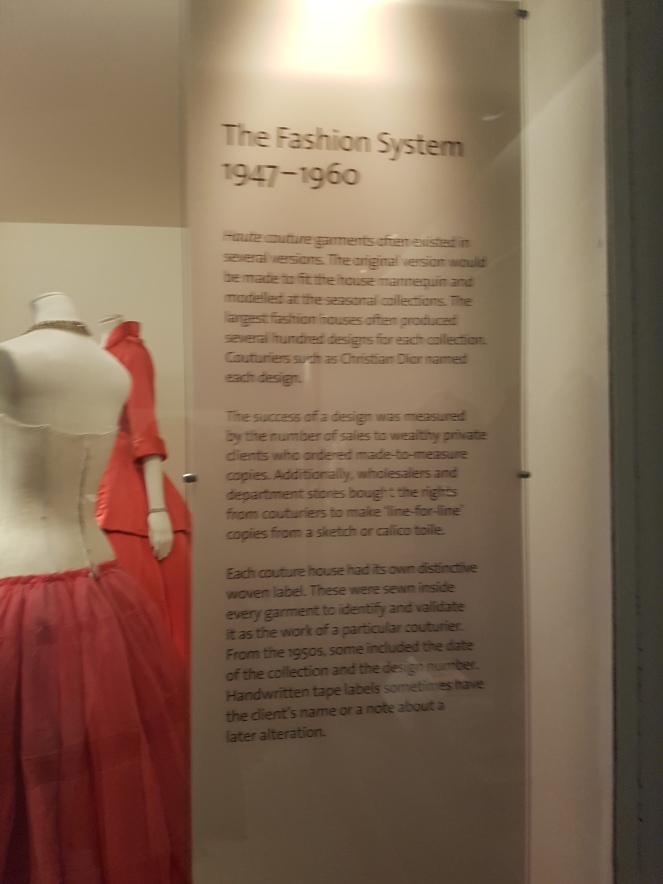
I visited the V&A museum in the summer which had exhibitions on Vintage fashion, including Undressed: A Brief History of Underwear
https://www.vam.ac.uk/articles/the-thong
I took photographs and picked up postcards of vintage fashion designs to include in my spreads.


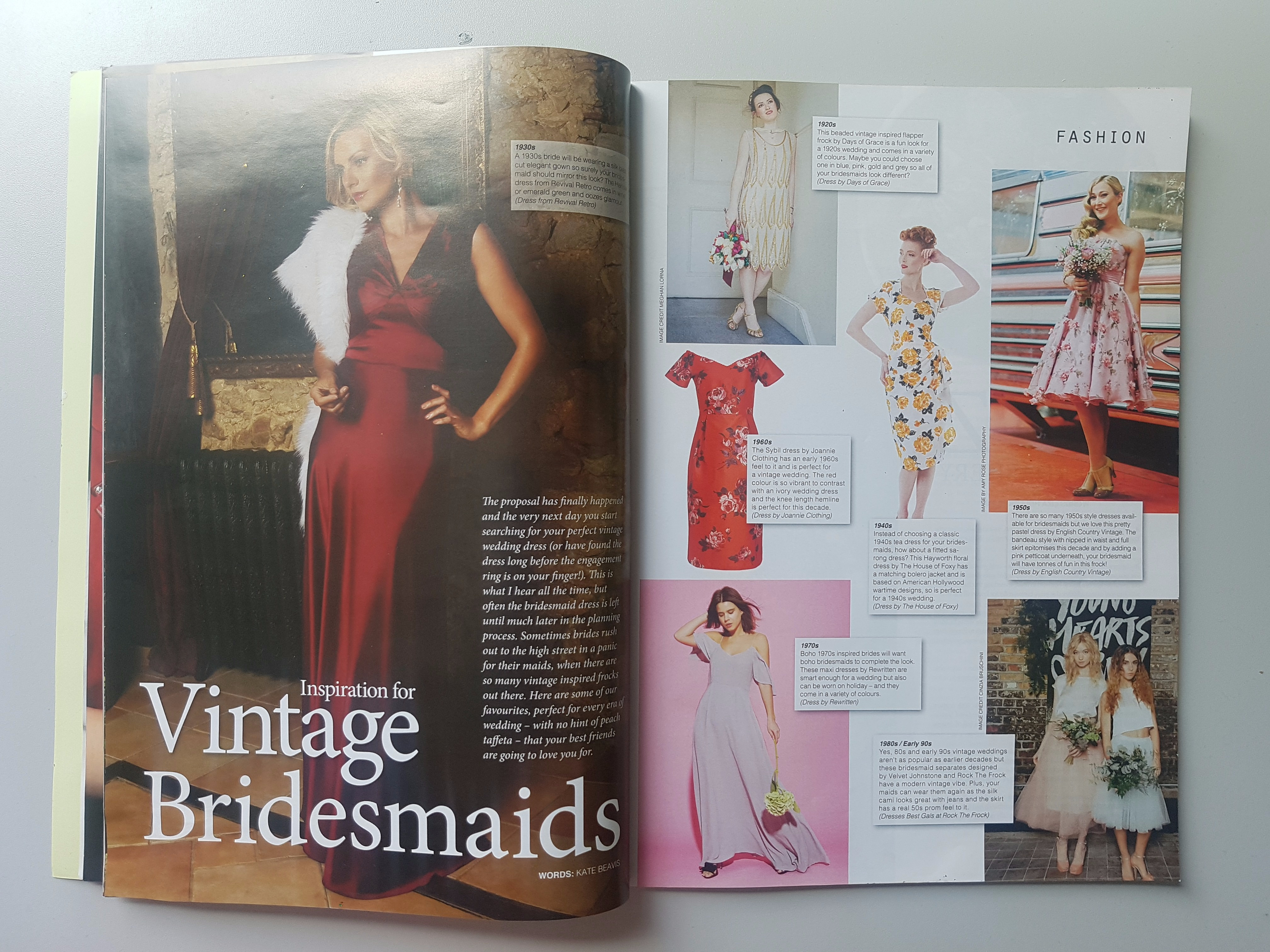
Based on the style of the layouts used in the magazine, i sketched out some ideas for possible layouts that would mirror the page layout design in the magazine. This is important to ensure that my design layouts does not compromise the overall style and flows with the other pages in the magazine.
I measured out the margins and gutter sizes and looked at the different articles covered.


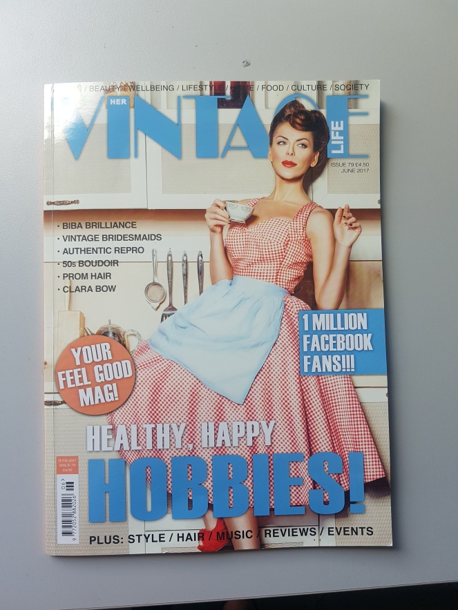
My chosen magazine for my 4 double page spread designs will be for a Vintage Magazine called ‘Her Vintage Life’
This magazine fits the brief by not measuring an A size and being my chosen topic of interest. I like the range of topics that can be covered in this magazine, which will allow me to choose different content for my spreads.
Size 21cm / 29cm
Important elements to consider for designing my spreads:
Spread 1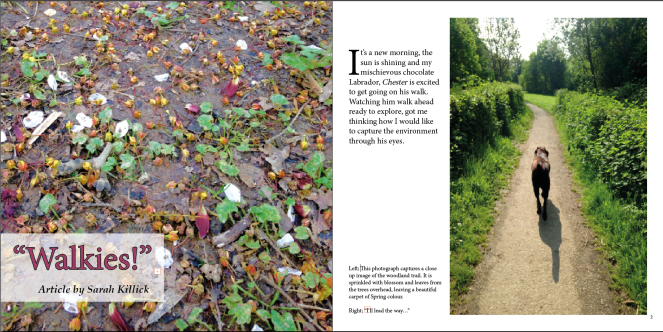
Spread 2
Evaluation
My design is clear because i have ensured to apply my knowledge from my research from looking at good and bad page layout designs and used this to produce a 2 clear page layout designs. As the layouts were focused on photography, i kept the background of my page white so the reader is focused on the photographs on the page. Simplicity works well here with no bold distracting colours and space on the page to allow a good composition.
My design is suitable for my intended audience of keen photograhers by portraying the images i took of my environment and using a grid layout to ensure to make the most of the design space on the page. I wrote about my photographs and my thought process behind them so the reader can gain an understanding of why i captured the images i did.
My typography is clear and consistent throughout. It is readable and placed well in the use of space on each page. My choice of typeface (Minion Pro – Regular) is appropriate as it has a professional tone of voice and is good for screen and print use. I have ensured not to add too much type throughout, and made the font size big enough for readability.
The images i have used are all of my own, which i took of the environment whilst walking my dog. I thought about my purpose of the photographs before i took them, being that i wanted to see the envoriment through a dogs eyes, which meant seeing things closer up than we do. I took the images with my iPhone and after selecting and rejecting my photographs i edited them to a high quality for my page spread. The images are clear and enjoyable to the reader. I used more images than type due to the fact of it being a photography magazine. I applied my research of page layouts to help my design process when thinking where to position them on the page. I was aware of the space on the page and the fold in the middle of the spread when positioning my images.
The navigation throughout my double page spreads is designed so the readers eye will flow effortlessly to follow the flow of information through the images and type on the pages. My research on page layouts highlighted this importance which helps identify good and bad layout designs.
My design elements:
Headline – I used the colour from the photograph the headline is on to make my headline stand out. I enlarged the text to 57pt to grab the readers attention. I kept the headline short which gives an idea of what the article spread is about. In order for the text to stand out from the image i placed the title on a white box and edited the capacity to still show some of the image behind. From my research i learnt that you can position headlines in the lower sense of the page to not compromise the readers eye to the Photograph.
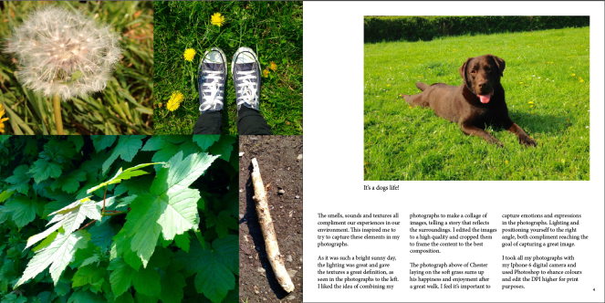
Image Caption – I used 2 image captions in my spreads, the first one on the second page is “I’ll lead the way…” which goes with the image of Chester walking up the path. I think this caption works well because the article is about seeing the environment from his point of view so having him invite the readers in was a great introduction. The second caption ‘It’s a dogs life!’ i placed together with the first caption, anchoring them with left and right titles so there reader knows which caption is for what image. I didn’t place the captions on the images because its a photography magazine i didn’t want to compromise the image. There was no room to place below the image, but i think the captions work well in the space they are.
Body Copy – I set the margins, columns and size of the body when designing the template of my page. The body copy is consistent on the pages and is designed to fit the type size of the text whilst accommodating the amount of words we had to use from the brief.
Folio – I placed the page numbers in the corners of the page so the reader can know at every moment what page they are on or need to go to. I didn’t place a page number on the first page due to the fact that the full page image bleeds out the page.
To improve the effectiveness of my design, i listened to tutors and peers throughout my design process and applied changes to my design ideas to produce my final design of my 2 page spreads on the Environment. As the time came to print, i asked a tutor to proof read and check my design on any further development that was needed. In my text there was a few (i)’s that i needed to change to (I) something i often oversee and need to remember for future reference. I had also made my font too big (14pt) on screen as i felt it looked too small on screen to go any lower. I learnt that magazine text is normally smaller and set the text to 11pt instead. Although this looked small on screen, this worked well on the print. Because i had changed the font size, this then made a lot more space on the page, something i was scared to see at this stage. After moving paragraphs around, i could see that the space complimented the page by showing off the photographs and worked well throughout the spread. Space is something i won’t be scared off in my future designs.
Print – When it came to print, my first page full bleed photograph didn’t print as well as it looked on screen. The image looked dull as did colour in the heading. It stood out against the other images which had printed crisp and sharp. I went back to edit my photo to increase the colour for re-print. After more feedback on the print I decided to make a couple more changes on my spreads, editing my text on the second page spread by adding in more words to fill the previous space of the article. I also decided to make my large image on the 3rd page (second page spread) to have full bleed on the page instead of having a white border as i felt it flowed better with the first double page spread being full bleed also. I moved and edited the photo captions on the first page spread for a more professional finish, and played with the heading of the article so that it had an outline on the font. I used a high gloss paper for my print to give a great effect to the photographs. i printed on A3 and cut to size (200×200 each page)
I am pleased with how the design has come together on all pages and i enjoyed taking the images of the Environment for this project.
Photographs of Chester’s Walk – Environment


After taking photographs of my environment, i selected and rejected the images i wanted to use in my spread. I wanted to use the most effective and high quality images, being a Photography magazine.
Selected Photographs –


This is the photography magazine layout that gave me inspiration for my layout on my 1st double page spread. The full bleed image on one page and the space in-between both images for the body copy gives a symmetrical look and balances the image and text to a good composition on the page.

I opened up a new document in In-Design, using the measurements given in the brief 200×200 / 4 pages.
I developed an asymmetrical grid of equally spaced modules which accommodates a dynamic use of images and text

1st Double Page Spread
I selected 2 images for my first page spread, the left page a full bleed image. Once the images were in position, i thought about adding in my body copy and heading.


I moved the heading down to the lower left hand corner to allow the readers eye to appreciate the image at the top of the page.

Once i placed my article in the column the design started to take place. I changed the headline of my article to introduce my readers to my article

I applied a drop cap on the first letter of my introduction paragraph to add interest to the design and moved the captions to the bottom of the body copy to inform the reader about the 2 images


I edited the heading type to have a more bold effect by applying a darker outline

2nd Double Page Spread
This is the photography magazine layout that gave me inspiration for my layout on my 2nd double page spread. I liked the idea of the images close together in a collage and how the text compliments the images at the bottom of the page. The full image on the right hand side is a great focal point for a photography magazine.

I used the same grid as the first page spread, and played around with the images i liked on the spread

I chose the image of Chester to be my main image on the right page which would be larger than the other complimentary images

I started creating a collage of images to make one large image, and made sure that the photograph of the stick was made smaller as it didn’t work well being a larger image

When i placed my article text on the page, i had to allow more room for the body copy which meant making the image of chester slightly smaller

Folio – i ensured to add page numbers to my spreads to help navigate the reader


Making the text size smaller allowed me more space to bring the caption down below the image. I also decided to break up the paragraphs in the body copy for easy reading and better composition on the page.

I then added extra text into my final article to fill the space in the bottom right hand corner to balance the columns symmetrically

At the final design stage, i edited the images on the left hand page to full bleed to balance the 2 double page spreads


